Match Delightful Pink
Jotun Delightful Pink is a mid-tone shade, warm in character with an LRV of 45. The matches below are ranked by ΔE, a perceptual color-difference score.
View full Delightful Pink color page →

Closest matches across every brand
One match per brand, ranked by ΔE — a perceptual color difference score calculated from Lab color space values. Lower is closer. Click any card to compare side by side in simulated rooms.


With LRVs of 45 and 44, the two reflect almost the same amount of light. At ΔE 1.1 you'd need them side by side to tell them apart.


With LRVs of 45 and 45, the two reflect almost the same amount of light. At ΔE 1.3 you'd need them side by side to tell them apart.


Their light reflectance is nearly identical (LRV 45 vs 43), so neither reads brighter in a room. A ΔE of 2.2 means the difference barely reads in a finished room.


Delightful Pink reads slightly lighter (LRV 45 vs 41), a gap that shows most in low-lit rooms. At ΔE 2.5 you'd need them side by side to tell them apart.


With LRVs of 47 and 45, the two reflect almost the same amount of light. At ΔE 3.0 they're clearly different, yet close enough to share a room.


Their light reflectance is nearly identical (LRV 47 vs 45), so neither reads brighter in a room. The ΔE 3.5 gap is real but not dramatic — distinct as a choice, harmonious together.


Their light reflectance is nearly identical (LRV 48 vs 45), so neither reads brighter in a room. The ΔE 3.8 gap is real but not dramatic — distinct as a choice, harmonious together.


With LRVs of 47 and 45, the two reflect almost the same amount of light. At ΔE 3.9 they're clearly different, yet close enough to share a room.


H467 reads slightly lighter (LRV 49 vs 45), a gap that shows most in low-lit rooms. At ΔE 4.4 they're clearly different, yet close enough to share a room.

A 4-point LRV gap (45 vs 41) makes Delightful Pink the marginally brighter of the two. The ΔE 4.6 gap is real but not dramatic — distinct as a choice, harmonious together.


Nutmeg Cluster 3 reads slightly lighter (LRV 49 vs 45), a gap that shows most in low-lit rooms. At ΔE 5.0 they're clearly different, yet close enough to share a room.


A 5-point LRV gap (45 vs 41) makes Delightful Pink the marginally brighter of the two. The ΔE 8.1 gap is real but not dramatic — distinct as a choice, harmonious together.

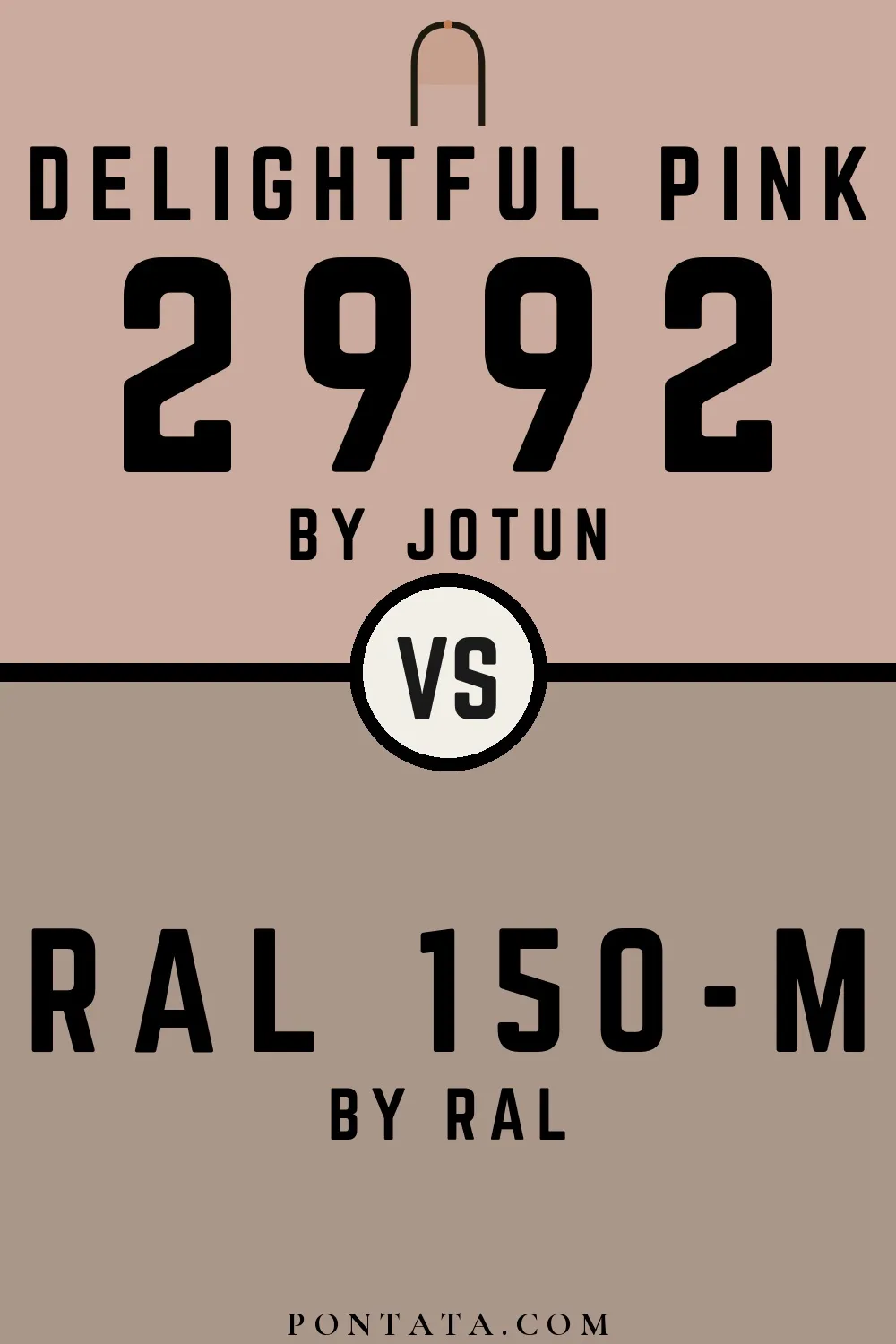

Delightful Pink reads slightly lighter (LRV 45 vs 33), a gap that shows most in low-lit rooms. At ΔE 9.7 they're clearly different, yet close enough to share a room.


With LRVs of 45 and 45, the two reflect almost the same amount of light. At ΔE 10.8 these are two genuinely different directions, not variations on a theme.