
Big Dipper
Big Dipper is a Neutral paint color from Sherwin-Williams, but its character reaches beyond a single label. It appears in Emerald Designer Edition - Rustic + Refined, placing it within several distinct decorating stories rather than a single fixed look. Move between the room imagery, color measurements and coordinating shades to build a fuller sense of how it might live in your space.
Hex
#41494BLRV
6.40
Big Dipper in Rooms
Follow Big Dipper from one space to another and watch how light, scale and surrounding materials reshape its character. 10 generated visualizations explore how the color might shape a finished room.
1 Bathroom Photo
1 bathroom image trace Big Dipper (9645) through the contrast between bright mornings and quieter evening light. Its place within Emerald Designer Edition - Rustic + Refined hints at the range of palettes it can inhabit.
Big Dipper — earthy bathroom
@mybudgetrecipes
1 Bedroom Photo
Big Dipper (9645) offers a starting mood rather than a finished formula: Its neutral temperature gives the surrounding palette unusual influence over the final mood. Test it under gentle morning light and low evening lamps.

A minimalist bedroom painted in Big Dipper
@mybudgetrecipes
1 Dining Room Photo
The room’s change from everyday meals to evening occasions can draw different notes from Big Dipper (9645). The blue, grey hue classifications suggest the subtle directions the color may take as the room changes.

Big Dipper paint in a traditional dining room
@mybudgetrecipes
1 Home Office Photo
The 1 home office image turn a neutral swatch into something more spatial and expressive. Its neutral temperature gives the surrounding palette unusual influence over the final mood.

Sherwin-Williams Big Dipper in a art deco home office
@mybudgetrecipes
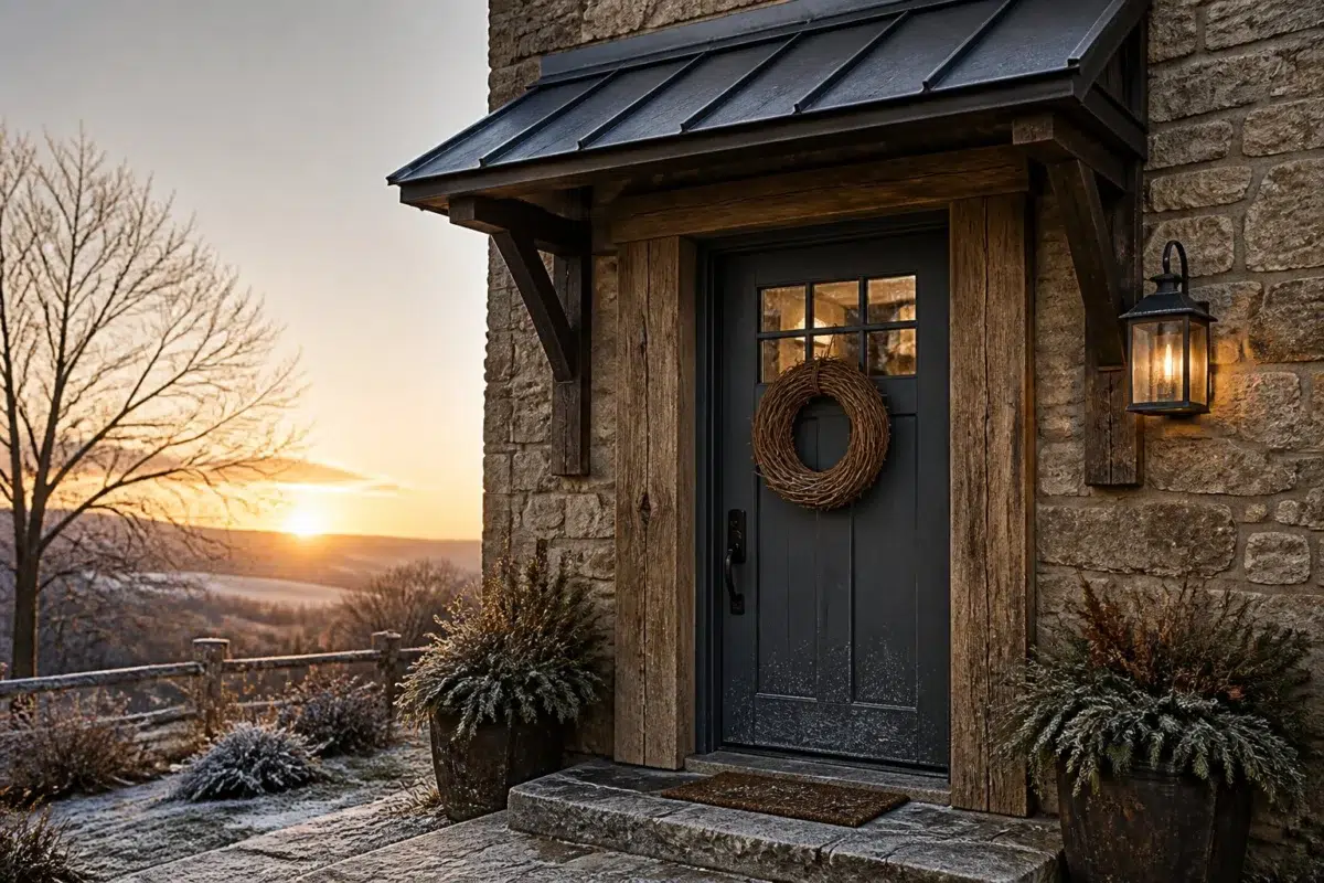
1 Front Door Photo
These 1 front door image show how Big Dipper (9645) can sit beside hardware, glazing, masonry, timber and surrounding trim. The blue, grey hue classifications suggest the subtle directions the color may take as the room changes.

rustic modern front door featuring Big Dipper by Sherwin-Williams
@mybudgetrecipes
1 House Photo
Big Dipper (9645) offers a starting mood rather than a finished formula: Its neutral temperature gives the surrounding palette unusual influence over the final mood. Test it under full daylight, cloud cover and long evening shadows.

Big Dipper color — mediterranean house inspiration
@mybudgetrecipes
1 Living Room Photo
The room’s shift from daytime energy to evening calm can draw different notes from Big Dipper (9645). The blue, grey hue classifications suggest the subtle directions the color may take as the room changes.

A cozy living room painted in Big Dipper
@mybudgetrecipes
1 Patio Photo
1 generated visualization explores how the color might shape the finished space. Together they show Big Dipper (9645) as inspiration rather than a promise of an identical result.

wabi-sabi patio featuring Big Dipper by Sherwin-Williams
@mybudgetrecipes
1 Kitchen Photo
The 1 kitchen image turn a neutral swatch into something more spatial and expressive. Its neutral temperature gives the surrounding palette unusual influence over the final mood.

Big Dipper — scandinavian kitchen
@mybudgetrecipes
1 Mudroom Photo
Big Dipper (9645) can change noticeably under doorway light and the softer illumination of an internal passage. Sample it beside the finishes that will remain in the room.

Big Dipper paint in a classy mudroom
@mybudgetrecipes
Expert Perspectives
Articles and features from across our network of home and design sites.
Coordinating Colors


At LRV 75 vs 6, Glacier Bay is decisively the brighter choice.

Pine Frost reflects far more light (LRV 65 vs 6), opening up a space where Big Dipper encloses it.


At LRV 51 vs 6, Hazel Gaze is decisively the brighter choice.
Similar Colors


Their light reflectance is nearly identical (LRV 6 vs 6), so neither reads brighter in a room.


Their light reflectance is nearly identical (LRV 7 vs 6), so neither reads brighter in a room.


With LRVs of 6 and 6, the two reflect almost the same amount of light.


With LRVs of 7 and 6, the two reflect almost the same amount of light.


With LRVs of 7 and 6, the two reflect almost the same amount of light.


With LRVs of 6 and 6, the two reflect almost the same amount of light.


With LRVs of 6 and 6, the two reflect almost the same amount of light.


Their light reflectance is nearly identical (LRV 7 vs 6), so neither reads brighter in a room.


Their light reflectance is nearly identical (LRV 6 vs 4), so neither reads brighter in a room.


Their light reflectance is nearly identical (LRV 6 vs 4), so neither reads brighter in a room.
Complementary Colors

At LRV 76 vs 6, Mauve Tinge is decisively the brighter choice.


Studio Mauve reflects far more light (LRV 50 vs 6), opening up a space where Big Dipper encloses it.


At LRV 35 vs 6, Truly Taupe is decisively the brighter choice.


At LRV 81 vs 6, Heavenly White is decisively the brighter choice.

Original White reflects far more light (LRV 74 vs 6), opening up a space where Big Dipper encloses it.

Palisade reflects far more light (LRV 35 vs 6), opening up a space where Big Dipper encloses it.


Griffin reads slightly lighter (LRV 13 vs 6), a gap that shows most in low-lit rooms.
Lighter Colors


Foggy Day reflects far more light (LRV 20 vs 6), opening up a space where Big Dipper encloses it.


Grays Harbor reads slightly lighter (LRV 12 vs 6), a gap that shows most in low-lit rooms.


A 8-point LRV gap (15 vs 6) makes Slate Tile the marginally brighter of the two.


Riverway reads slightly lighter (LRV 16 vs 6), a gap that shows most in low-lit rooms.
Their light reflectance is nearly identical (LRV 6 vs 6), so neither reads brighter in a room.
Color Codes
Manufacturer description
Sink into the quiet mystery of a starlit night sky with this profound dark neutral and its subtle cool undertones. Perfect for creating intimate, contemplative spaces like libraries or bedrooms, it grounds a room with sophisticated restraint.
Attributed to Sherwin-Williams catalog data.