
Blue Mosque
Blue Mosque is a Blue paint color from Sherwin-Williams, but its character reaches beyond a single label. Its blue classifications hint at the directions it may take as daylight, lamps and neighboring colors move around it. The manufacturer's description below offers one reading; the room imagery leaves space for your own.
Hex
#01819ELRV
17.17
Blue Mosque's Color Strip
Blue Mosque is the sixth shade on this 7-color strip, sitting between Capri and Adriatic Sea. The strip spans from Quench Blue at the lightest end to Adriatic Sea at the deepest. Browsing strip 167 alongside this color helps you gauge whether to go lighter, darker, or stay right here.


Blue Mosque in Rooms
Follow Blue Mosque from one space to another and watch how light, scale and surrounding materials reshape its character. 10 generated visualizations explore how the color might shape a finished room.
1 Home Office Photo
1 home office image trace Blue Mosque (6789) through the transition between focused work and the rest of the home. The blue hue classifications suggest the subtle directions the color may take as the room changes.
Sherwin-Williams Blue Mosque in a neutral home office
@mybudgetrecipes
1 Bathroom Photo
Blue Mosque (6789) offers a starting mood rather than a finished formula: Its cool classification can bring a composed, clean tension to warmer finishes. Test it under window light, mirrors and focused task lighting.

Blue Mosque — vintage bathroom
@mybudgetrecipes
1 Bedroom Photo
The slower pace of morning and night can draw different notes from Blue Mosque (6789). The blue hue classifications suggest the subtle directions the color may take as the room changes.

A minimalist bedroom painted in Blue Mosque
@mybudgetrecipes
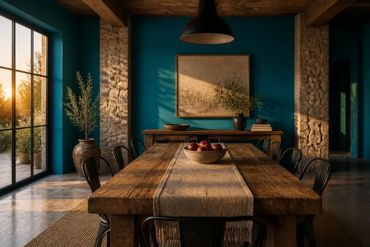
1 Dining Room Photo
Blue Mosque (6789) offers a starting mood rather than a finished formula: Its cool classification can bring a composed, clean tension to warmer finishes. Test it under natural light, candles and pendant lighting.

Blue Mosque paint in a rustic modern dining room
@mybudgetrecipes
1 Front Door Photo
Blue Mosque (6789) brings its blue character into a small architectural moment with an outsized first impression. Its brighter saturation allows the hue to remain present rather than fading quietly into the background.

stylish front door featuring Blue Mosque by Sherwin-Williams
@mybudgetrecipes
1 House Photo
In an exterior viewed across distance, weather and the changing sky, the most interesting quality of Blue Mosque (6789) may be the way it responds to roofing, masonry, timber, planting and trim. The blue hue classifications suggest the subtle directions the color may take as the room changes.

Blue Mosque color — eclectic house inspiration
@mybudgetrecipes
1 Living Room Photo
Against upholstery, timber, art and metal accents, Blue Mosque (6789) may feel quieter, sharper or more atmospheric than the digital swatch alone. With an LRV of 17.2, it carries enough visual weight to make light, trim and texture feel especially deliberate.

A cozy living room painted in Blue Mosque
@mybudgetrecipes
1 Mudroom Photo
The blue hue classifications suggest the subtle directions the color may take as the room changes. In this setting, let doorway light and the softer illumination of an internal passage and flooring, storage, timber, baskets and hardware guide the final sample decision.

Blue Mosque paint in a cottagecore mudroom
@mybudgetrecipes
1 Kitchen Photo
Blue Mosque (6789) can change noticeably under daylight, task lighting and evening pendants. Sample it beside the finishes that will remain in the room.

Blue Mosque — contemporary kitchen
@mybudgetrecipes
1 Patio Photo
In an outdoor room surrounded by sky, planting and open light, the most interesting quality of Blue Mosque (6789) may be the way it responds to stone, timber, metal, textiles and greenery. The blue hue classifications suggest the subtle directions the color may take as the room changes.

warm patio featuring Blue Mosque by Sherwin-Williams
@mybudgetrecipes
Expert Perspectives
Articles and features from across our network of home and design sites.
Coordinating Colors


Bravo Blue reflects far more light (LRV 77 vs 17), opening up a space where Blue Mosque encloses it.


At LRV 33 vs 17, Artisan Tan is decisively the brighter choice.

A 8-point LRV gap (17 vs 9) makes Blue Mosque the marginally brighter of the two.
Trim Color
Bravo Blue reflects far more light (LRV 77 vs 17), opening up a space where Blue Mosque encloses it.
Similar Colors


Their light reflectance is nearly identical (LRV 19 vs 17), so neither reads brighter in a room.


With LRVs of 17 and 16, the two reflect almost the same amount of light.


With LRVs of 17 and 17, the two reflect almost the same amount of light.


Their light reflectance is nearly identical (LRV 17 vs 17), so neither reads brighter in a room.

With LRVs of 17 and 16, the two reflect almost the same amount of light.


Their light reflectance is nearly identical (LRV 17 vs 15), so neither reads brighter in a room.


Impromptu reads slightly lighter (LRV 23 vs 17), a gap that shows most in low-lit rooms.


With LRVs of 17 and 15, the two reflect almost the same amount of light.


A 5-point LRV gap (22 vs 17) makes Secure Blue the marginally brighter of the two.

A 5-point LRV gap (22 vs 17) makes Stratford Blue the marginally brighter of the two.
Complementary Colors


With LRVs of 18 and 17, the two reflect almost the same amount of light.


At LRV 68 vs 17, Blushing is decisively the brighter choice.


At LRV 67 vs 17, Creamery is decisively the brighter choice.


At LRV 29 vs 17, Emberglow is decisively the brighter choice.


At LRV 30 vs 17, Copper Harbor is decisively the brighter choice.


Bella Pink reflects far more light (LRV 63 vs 17), opening up a space where Blue Mosque encloses it.


Their light reflectance is nearly identical (LRV 17 vs 17), so neither reads brighter in a room.
Lighter Colors


Calypso reflects far more light (LRV 34 vs 17), opening up a space where Blue Mosque encloses it.


Capri reads slightly lighter (LRV 28 vs 17), a gap that shows most in low-lit rooms.

Resonant Blue reflects far more light (LRV 30 vs 17), opening up a space where Blue Mosque encloses it.
Impromptu reads slightly lighter (LRV 23 vs 17), a gap that shows most in low-lit rooms.
With LRVs of 17 and 17, the two reflect almost the same amount of light.
Darker Colors


A 5-point LRV gap (17 vs 12) makes Blue Mosque the marginally brighter of the two.


Blue Mosque reads slightly lighter (LRV 17 vs 8), a gap that shows most in low-lit rooms.


Blue Mosque reads slightly lighter (LRV 17 vs 9), a gap that shows most in low-lit rooms.
Their light reflectance is nearly identical (LRV 19 vs 17), so neither reads brighter in a room.

Mosaic Tile reflects far more light (LRV NaN vs NaN), opening up a space where Blue Mosque encloses it.
Color Codes
Manufacturer description
Step into a jewel-toned sanctuary with this rich, saturated medium blue that echoes the luminous depths of lapis lazuli and ancient tile work. Perfect for creating an intimate, contemplative atmosphere in bedrooms or studies, it pairs beautifully with warm metallics and cream accents to amplify its luxurious, worldly elegance.