
Bluesy Note
Sherwin-Williams Bluesy Note (9064) carries the measured structure of its color data and the less predictable beauty of paint in a finished space. Its cool classification gives it a crisper edge that may become clearer beside warm timber, cream or brass. Treat the digital swatch as an opening note, then watch a physical sample from morning light through evening lamps.
Hex
#7C9AB5LRV
30.72
Bluesy Note's Color Strip
Bluesy Note is the fourth shade on this 7-color strip, sitting between Cosmos and Scanda. The strip spans from Icelandic at the lightest end to Indigo at the deepest. Strip 178 makes it easy to compare shades side by side and find the right depth for your space.


Bluesy Note in Rooms
Follow Bluesy Note from one space to another and watch how light, scale and surrounding materials reshape its character. 10 generated visualizations explore how the color might shape a finished room.
1 Front Door Photo
Across 1 front door image, Bluesy Note (9064) meets direct sun, porch shade and evening exterior light. Its cool classification can bring a composed, clean tension to warmer finishes.
rustic modern front door featuring Bluesy Note by Sherwin-Williams
@mybudgetrecipes
1 Bedroom Photo
1 bedroom image trace Bluesy Note (9064) through the slower pace of morning and night. The blue hue classifications suggest the subtle directions the color may take as the room changes.

A boho bedroom painted in Bluesy Note
@mybudgetrecipes
1 Home Office Photo
The transition between focused work and the rest of the home can draw different notes from Bluesy Note (9064). The blue hue classifications suggest the subtle directions the color may take as the room changes.

Sherwin-Williams Bluesy Note in a warm home office
@mybudgetrecipes
1 Bathroom Photo
The blue hue classifications suggest the subtle directions the color may take as the room changes. In this setting, let window light, mirrors and focused task lighting and tile, stone, glass, timber and metal fixtures guide the final sample decision.

Bluesy Note — moody bathroom
@mybudgetrecipes
1 Dining Room Photo
Bluesy Note (9064) moves through 1 dining room image without becoming a fixed prescription for the room. Its cool classification can bring a composed, clean tension to warmer finishes.

Bluesy Note paint in a art deco dining room
@mybudgetrecipes
1 Mudroom Photo
The 1 mudroom image turn a purple swatch into something more spatial and expressive. Its brighter saturation allows the hue to remain present rather than fading quietly into the background.

Bluesy Note paint in a rustic modern mudroom
@mybudgetrecipes
1 Patio Photo
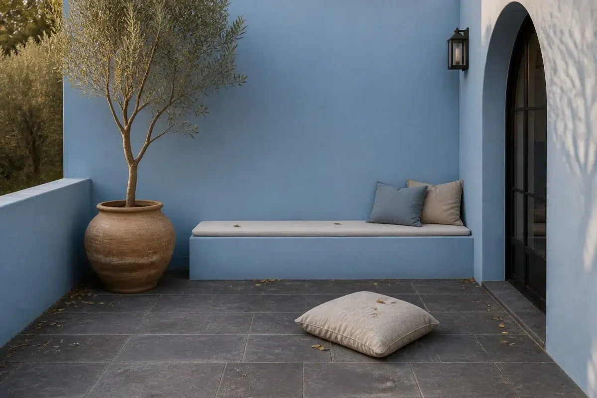
These 1 patio image show how Bluesy Note (9064) can sit beside stone, timber, metal, textiles and greenery. The blue hue classifications suggest the subtle directions the color may take as the room changes.

aesthetic patio featuring Bluesy Note by Sherwin-Williams
@mybudgetrecipes
1 House Photo
Bluesy Note (9064) moves through 1 house image without becoming a fixed prescription for the room. Its cool classification can bring a composed, clean tension to warmer finishes.

Bluesy Note color — modern luxury house inspiration
@mybudgetrecipes
1 Living Room Photo
1 generated visualization explores how the color might shape the finished space. Together they show Bluesy Note (9064) as inspiration rather than a promise of an identical result.

A scandinavian living room painted in Bluesy Note
@mybudgetrecipes
1 Kitchen Photo
1 kitchen image trace Bluesy Note (9064) through the changing light from breakfast through dinner. The blue hue classifications suggest the subtle directions the color may take as the room changes.

Bluesy Note — industrial kitchen
@mybudgetrecipes
Expert Perspectives
Articles and features from across our network of home and design sites.
Coordinating Colors


Rarified Air reflects far more light (LRV 78 vs 31), opening up a space where Bluesy Note encloses it.


Alabaster reflects far more light (LRV 82 vs 31), opening up a space where Bluesy Note encloses it.


A 7-point LRV gap (38 vs 31) makes Latte the marginally brighter of the two.
Trim Color
Rarified Air reflects far more light (LRV 78 vs 31), opening up a space where Bluesy Note encloses it.
Similar Colors


With LRVs of 31 and 30, the two reflect almost the same amount of light.

Their light reflectance is nearly identical (LRV 31 vs 30), so neither reads brighter in a room.


Their light reflectance is nearly identical (LRV 31 vs 29), so neither reads brighter in a room.


A 3-point LRV gap (34 vs 31) makes Baby Blue Eyes the marginally brighter of the two.


A 6-point LRV gap (37 vs 31) makes Notable Hue the marginally brighter of the two.


A 7-point LRV gap (38 vs 31) makes Cosmos the marginally brighter of the two.

A 6-point LRV gap (31 vs 25) makes Bluesy Note the marginally brighter of the two.


Their light reflectance is nearly identical (LRV 32 vs 31), so neither reads brighter in a room.


With LRVs of 31 and 31, the two reflect almost the same amount of light.


A 7-point LRV gap (31 vs 24) makes Bluesy Note the marginally brighter of the two.
Complementary Colors


A 5-point LRV gap (35 vs 31) makes Truly Taupe the marginally brighter of the two.


At LRV 81 vs 31, Heavenly White is decisively the brighter choice.

Original White reflects far more light (LRV 74 vs 31), opening up a space where Bluesy Note encloses it.

Palisade reads slightly lighter (LRV 35 vs 31), a gap that shows most in low-lit rooms.


Bluesy Note reflects far more light (LRV 31 vs 13), opening up a space where Griffin encloses it.


Bluesy Note reads slightly lighter (LRV 31 vs 20), a gap that shows most in low-lit rooms.


At LRV 61 vs 31, Mercurial is decisively the brighter choice.
Lighter Colors
A 3-point LRV gap (34 vs 31) makes Baby Blue Eyes the marginally brighter of the two.
A 6-point LRV gap (37 vs 31) makes Notable Hue the marginally brighter of the two.


At LRV 43 vs 31, Respite is decisively the brighter choice.


At LRV 55 vs 31, Honest Blue is decisively the brighter choice.
A 7-point LRV gap (38 vs 31) makes Cosmos the marginally brighter of the two.
Darker Colors
A 6-point LRV gap (31 vs 25) makes Bluesy Note the marginally brighter of the two.


Bluesy Note reflects far more light (LRV 31 vs 14), opening up a space where Revel Blue encloses it.


Bluesy Note reflects far more light (LRV 31 vs 14), opening up a space where Denim encloses it.
A 7-point LRV gap (31 vs 24) makes Bluesy Note the marginally brighter of the two.
With LRVs of 31 and 30, the two reflect almost the same amount of light.
Color Codes
Manufacturer description
This richly saturated purple sings with cool blue undertones, evoking the moody elegance of a jazz club or artist's studio. Create an intimate, creative sanctuary by pairing it with deep jewel tones or soft neutrals like cream and gray.