
Breaktime
Sherwin-Williams's Breaktime is a green shade whose quieter details emerge through comparison. An LRV of 65.9 places it through the middle of the scale, where color and depth can remain visible as the light changes. 10 generated visualizations explore how the color might shape a finished room.
Hex
#C4D9CELRV
65.92
Breaktime's Color Strip
Breaktime is the first shade on this 7-color strip, the lightest in this coordinated family. Strip 160 puts these related shades in sequence, making it simple to find the tone that suits your room.


Breaktime in Rooms
Follow Breaktime from one space to another and watch how light, scale and surrounding materials reshape its character. 10 generated visualizations explore how the color might shape a finished room.
1 Bedroom Photo
1 bedroom image place Breaktime (6463) in a room designed around rest, softness and retreat. An LRV of 65.9 lets the color hold its identity across both brighter and more shaded parts of the room.
A moody bedroom painted in Breaktime
@mybudgetrecipes
1 Dining Room Photo
Viewed across 1 dining room image in a gathering space that can move from daylight to ceremony, Breaktime (6463) reveals how much color depends on scale, surface and shadow. An LRV of 65.9 lets the color hold its identity across both brighter and more shaded parts of the room.

Breaktime paint in a traditional dining room
@mybudgetrecipes
1 Front Door Photo
In a small architectural moment with an outsized first impression, the most interesting quality of Breaktime (6463) may be the way it responds to hardware, glazing, masonry, timber and surrounding trim. The green hue classifications suggest the subtle directions the color may take as the room changes.

classy front door featuring Breaktime by Sherwin-Williams
@mybudgetrecipes
1 Bathroom Photo
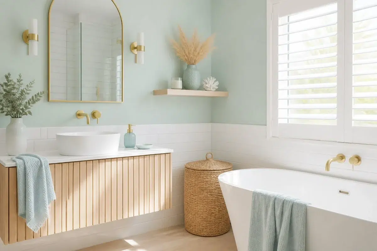
1 bathroom image place Breaktime (6463) in a compact setting where tile, fixtures and color sit close together. An LRV of 65.9 lets the color hold its identity across both brighter and more shaded parts of the room.

Breaktime — coastal bathroom
@mybudgetrecipes
1 Home Office Photo
Breaktime (6463) brings its green character into a focused room balancing work, concentration and comfort. Its midtone saturation keeps the color expressive without letting it dominate every surface around it.

Sherwin-Williams Breaktime in a mid century home office
@mybudgetrecipes
1 Living Room Photo
Breaktime (6463) brings its green character into a space shaped by conversation, quiet evenings and changing daylight. Its midtone saturation keeps the color expressive without letting it dominate every surface around it.

A hollywood regency living room painted in Breaktime
@mybudgetrecipes
1 Mudroom Photo
These 1 mudroom image show how Breaktime (6463) can sit beside flooring, storage, timber, baskets and hardware. The green hue classifications suggest the subtle directions the color may take as the room changes.

Breaktime paint in a cottagecore mudroom
@mybudgetrecipes
1 House Photo
These 1 house image show how Breaktime (6463) can sit beside roofing, masonry, timber, planting and trim. The green hue classifications suggest the subtle directions the color may take as the room changes.

Breaktime color — aesthetic house inspiration
@mybudgetrecipes
1 Kitchen Photo
Its place within Gentle Medley and Living Well hints at the range of palettes it can inhabit. In this setting, let daylight, task lighting and evening pendants and stone, timber, tile and metal finishes guide the final sample decision.

Breaktime — industrial kitchen
@mybudgetrecipes
1 Patio Photo
The broad shift from bright afternoon to dusk can draw different notes from Breaktime (6463). The green hue classifications suggest the subtle directions the color may take as the room changes.

coastal patio featuring Breaktime by Sherwin-Williams
@mybudgetrecipes
Expert Perspectives
Articles and features from across our network of home and design sites.
Coordinating Colors


A 9-point LRV gap (75 vs 66) makes Green Trance the marginally brighter of the two.


At LRV 66 vs 47, Breaktime is decisively the brighter choice.
Trim Color
A 9-point LRV gap (75 vs 66) makes Green Trance the marginally brighter of the two.
Similar Colors


A 4-point LRV gap (66 vs 62) makes Breaktime the marginally brighter of the two.


Their light reflectance is nearly identical (LRV 66 vs 64), so neither reads brighter in a room.


Mint Condition reads slightly lighter (LRV 73 vs 66), a gap that shows most in low-lit rooms.


With LRVs of 66 and 65, the two reflect almost the same amount of light.


Their light reflectance is nearly identical (LRV 66 vs 66), so neither reads brighter in a room.
A 9-point LRV gap (75 vs 66) makes Green Trance the marginally brighter of the two.


At LRV 79 vs 66, Embellished Blue is decisively the brighter choice.


A 9-point LRV gap (66 vs 57) makes Breaktime the marginally brighter of the two.
Complementary Colors

At LRV 79 vs 66, Whimsical White is decisively the brighter choice.

Breaktime reflects far more light (LRV 66 vs 24), opening up a space where Ruby Violet encloses it.

At LRV 66 vs 17, Breaktime is decisively the brighter choice.


Their light reflectance is nearly identical (LRV 66 vs 64), so neither reads brighter in a room.


Breaktime reflects far more light (LRV 66 vs 51), opening up a space where Mauve Finery encloses it.


At LRV 66 vs 13, Breaktime is decisively the brighter choice.
Lighter Colors

Timid Blue reflects far more light (LRV 79 vs 66), opening up a space where Breaktime encloses it.
Darker Colors


A 4-point LRV gap (66 vs 62) makes Breaktime the marginally brighter of the two.


Color Codes
Manufacturer description
This light green with its cool blue undertone provides a lighthearted and untroubled vibe in most spaces. Pair with a light blue to match that contented vibe.