
Browse Brown
Browse Brown begins as a purple color on paper, then shifts with every surface, shadow and neighboring material. Its grey classifications hint at the directions it may take as daylight, lamps and neighboring colors move around it. The manufacturer's description below offers one reading; the room imagery leaves space for your own.
Hex
#6E615FLRV
12.69
Browse Brown's Color Strip
Browse Brown is the sixth shade on this 7-color strip, sitting between Chinchilla and Bitter Chocolate. The strip spans from Individual White at the lightest end to Bitter Chocolate at the deepest. Browsing strip 231 alongside this color helps you gauge whether to go lighter, darker, or stay right here.


Browse Brown in Rooms
Follow Browse Brown from one space to another and watch how light, scale and surrounding materials reshape its character. 10 generated visualizations explore how the color might shape a finished room.
1 Dining Room Photo
Browse Brown (6012) brings its purple character into a gathering space that can move from daylight to ceremony. Its muted saturation softens the color’s edges, making texture and shadow part of the composition.
Browse Brown paint in a mid century dining room
@mybudgetrecipes
1 Home Office Photo
In a focused room balancing work, concentration and comfort, the most interesting quality of Browse Brown (6012) may be the way it responds to wood, paper, shelving and upholstered seating. The grey hue classifications suggest the subtle directions the color may take as the room changes.

Sherwin-Williams Browse Brown in a neutral home office
@mybudgetrecipes
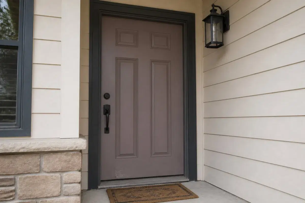
1 Front Door Photo
In a small architectural moment with an outsized first impression, the most interesting quality of Browse Brown (6012) may be the way it responds to hardware, glazing, masonry, timber and surrounding trim. The grey hue classifications suggest the subtle directions the color may take as the room changes.

bold front door featuring Browse Brown by Sherwin-Williams
@mybudgetrecipes
1 Bedroom Photo
These 1 bedroom image show how Browse Brown (6012) can sit beside bed linen, timber, wool and upholstered textures. The grey hue classifications suggest the subtle directions the color may take as the room changes.

A art deco bedroom painted in Browse Brown
@mybudgetrecipes
1 Bathroom Photo
Viewed across 1 bathroom image in a compact setting where tile, fixtures and color sit close together, Browse Brown (6012) reveals how much color depends on scale, surface and shadow. With an LRV of 12.7, it carries enough visual weight to make light, trim and texture feel especially deliberate.

Browse Brown — earthy bathroom
@mybudgetrecipes
1 Living Room Photo
The grey hue classifications suggest the subtle directions the color may take as the room changes. In this setting, let the movement from window light to lamplight and upholstery, timber, art and metal accents guide the final sample decision.

A minimalist living room painted in Browse Brown
@mybudgetrecipes
1 House Photo
Viewed across 1 house image in an exterior viewed across distance, weather and the changing sky, Browse Brown (6012) reveals how much color depends on scale, surface and shadow. With an LRV of 12.7, it carries enough visual weight to make light, trim and texture feel especially deliberate.

Browse Brown color — transitional house inspiration
@mybudgetrecipes
1 Kitchen Photo
The changing light from breakfast through dinner can draw different notes from Browse Brown (6012). The grey hue classifications suggest the subtle directions the color may take as the room changes.

Browse Brown — contemporary kitchen
@mybudgetrecipes
1 Mudroom Photo
The grey hue classifications suggest the subtle directions the color may take as the room changes. In this setting, let doorway light and the softer illumination of an internal passage and flooring, storage, timber, baskets and hardware guide the final sample decision.

Browse Brown paint in a small mudroom
@mybudgetrecipes
1 Patio Photo
Browse Brown (6012) moves through 1 patio image without becoming a fixed prescription for the room. Its neutral temperature gives the surrounding palette unusual influence over the final mood.

mediterranean patio featuring Browse Brown by Sherwin-Williams
@mybudgetrecipes
Expert Perspectives
Articles and features from across our network of home and design sites.
Coordinating Colors


Smart White reflects far more light (LRV 72 vs 13), opening up a space where Browse Brown encloses it.


Coriander Powder reflects far more light (LRV 36 vs 13), opening up a space where Browse Brown encloses it.


At LRV 53 vs 13, Niebla Azul is decisively the brighter choice.
Trim Color
Smart White reflects far more light (LRV 72 vs 13), opening up a space where Browse Brown encloses it.
Similar Colors


With LRVs of 13 and 13, the two reflect almost the same amount of light.


With LRVs of 15 and 13, the two reflect almost the same amount of light.


Their light reflectance is nearly identical (LRV 13 vs 11), so neither reads brighter in a room.

Their light reflectance is nearly identical (LRV 13 vs 12), so neither reads brighter in a room.


Their light reflectance is nearly identical (LRV 13 vs 12), so neither reads brighter in a room.


With LRVs of 13 and 11, the two reflect almost the same amount of light.


With LRVs of 13 and 12, the two reflect almost the same amount of light.


Grapy reads slightly lighter (LRV 16 vs 13), a gap that shows most in low-lit rooms.


With LRVs of 13 and 12, the two reflect almost the same amount of light.
Complementary Colors


At LRV 73 vs 13, Mountain Air is decisively the brighter choice.
At LRV 53 vs 13, Niebla Azul is decisively the brighter choice.


Silver Lake reflects far more light (LRV 53 vs 13), opening up a space where Browse Brown encloses it.


With LRVs of 16 and 13, the two reflect almost the same amount of light.


Glass Bead reflects far more light (LRV 77 vs 13), opening up a space where Browse Brown encloses it.


At LRV 29 vs 13, Morning at Sea is decisively the brighter choice.


A 7-point LRV gap (13 vs 6) makes Browse Brown the marginally brighter of the two.
Lighter Colors
With LRVs of 13 and 13, the two reflect almost the same amount of light.


Renwick Heather reads slightly lighter (LRV 22 vs 13), a gap that shows most in low-lit rooms.


Auger Shell reflects far more light (LRV 30 vs 13), opening up a space where Browse Brown encloses it.


Chinchilla reads slightly lighter (LRV 20 vs 13), a gap that shows most in low-lit rooms.


Socialite reads slightly lighter (LRV 20 vs 13), a gap that shows most in low-lit rooms.
Darker Colors

A 4-point LRV gap (13 vs 8) makes Browse Brown the marginally brighter of the two.

A 8-point LRV gap (13 vs 4) makes Browse Brown the marginally brighter of the two.


A 8-point LRV gap (13 vs 5) makes Browse Brown the marginally brighter of the two.
Color Codes
Manufacturer description
Settle into the contemplative depths of this dark, muted purple-brown—a color that whispers of old library shelves and vintage leather-bound volumes. Its neutral undertone makes it surprisingly versatile, bringing understated elegance and intellectual warmth to studies, bedrooms, or accent walls paired with cream or soft gray.