
Castlegate
Sherwin-Williams Castlegate (9558) carries the measured structure of its color data and the less predictable beauty of paint in a finished space. Its neutral temperature leaves room for surrounding materials and light to pull the color warmer or cooler. Treat the digital swatch as an opening note, then watch a physical sample from morning light through evening lamps.
Hex
#A0A5A5LRV
37.02
Castlegate in Rooms
Follow Castlegate from one space to another and watch how light, scale and surrounding materials reshape its character. 10 generated visualizations explore how the color might shape a finished room.
1 Front Door Photo
1 generated visualization explores how the color might shape the finished space. Together they show Castlegate (9558) as inspiration rather than a promise of an identical result.
modern luxury front door featuring Castlegate by Sherwin-Williams
@mybudgetrecipes
1 Dining Room Photo
1 generated visualization explores how the color might shape the finished space. Together they show Castlegate (9558) as inspiration rather than a promise of an identical result.

Castlegate paint in a art deco dining room
@mybudgetrecipes
1 Bathroom Photo
Castlegate (9558) moves through 1 bathroom image without becoming a fixed prescription for the room. Its neutral temperature gives the surrounding palette unusual influence over the final mood.

Castlegate — minimalist bathroom
@mybudgetrecipes
1 Living Room Photo
1 living room image trace Castlegate (9558) through the room’s shift from daytime energy to evening calm. Its place within Emerald Designer Edition - Minimal + Modern hints at the range of palettes it can inhabit.

Sherwin-Williams Castlegate in a scandinavian living room
@mybudgetrecipes
1 Patio Photo
Viewed across 1 patio image in an outdoor room surrounded by sky, planting and open light, Castlegate (9558) reveals how much color depends on scale, surface and shadow. An LRV of 37.0 lets the color hold its identity across both brighter and more shaded parts of the room.

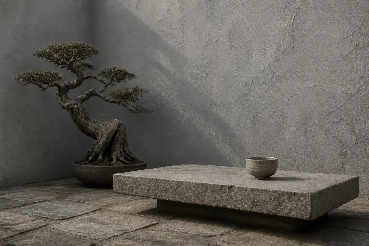
Castlegate — wabi-sabi patio
@mybudgetrecipes
1 Home Office Photo
These 1 home office image show how Castlegate (9558) can sit beside wood, paper, shelving and upholstered seating. The grey hue classifications suggest the subtle directions the color may take as the room changes.

A contemporary home office painted in Castlegate
@mybudgetrecipes
1 Mudroom Photo
Across 1 mudroom image, Castlegate (9558) meets doorway light and the softer illumination of an internal passage. Its neutral temperature gives the surrounding palette unusual influence over the final mood.

Sherwin-Williams Castlegate in a earthy mudroom
@mybudgetrecipes
1 Bedroom Photo
These 1 bedroom image show how Castlegate (9558) can sit beside bed linen, timber, wool and upholstered textures. The grey hue classifications suggest the subtle directions the color may take as the room changes.

Castlegate — industrial bedroom
@mybudgetrecipes
1 House Photo
These 1 house image show how Castlegate (9558) can sit beside roofing, masonry, timber, planting and trim. The grey hue classifications suggest the subtle directions the color may take as the room changes.

Castlegate paint in a mediterranean house
@mybudgetrecipes
1 Kitchen Photo
These 1 kitchen image show how Castlegate (9558) can sit beside stone, timber, tile and metal finishes. The grey hue classifications suggest the subtle directions the color may take as the room changes.

classy kitchen featuring Castlegate by Sherwin-Williams
@mybudgetrecipes
Expert Perspectives
Articles and features from across our network of home and design sites.
Coordinating Colors


Natural White reflects far more light (LRV 83 vs 37), opening up a space where Castlegate encloses it.


At LRV 57 vs 37, Autonomous is decisively the brighter choice.

Castlegate reflects far more light (LRV 37 vs 14), opening up a space where Night Out encloses it.
Similar Colors


Their light reflectance is nearly identical (LRV 37 vs 37), so neither reads brighter in a room.


With LRVs of 39 and 37, the two reflect almost the same amount of light.


Their light reflectance is nearly identical (LRV 38 vs 37), so neither reads brighter in a room.


Morning Fog reads slightly lighter (LRV 42 vs 37), a gap that shows most in low-lit rooms.


Uncertain Gray reads slightly lighter (LRV 43 vs 37), a gap that shows most in low-lit rooms.


Their light reflectance is nearly identical (LRV 39 vs 37), so neither reads brighter in a room.


With LRVs of 38 and 37, the two reflect almost the same amount of light.


Their light reflectance is nearly identical (LRV 37 vs 34), so neither reads brighter in a room.


Mineral Deposit reads slightly lighter (LRV 43 vs 37), a gap that shows most in low-lit rooms.


With LRVs of 40 and 37, the two reflect almost the same amount of light.
Complementary Colors

At LRV 76 vs 37, Mauve Tinge is decisively the brighter choice.


Studio Mauve reflects far more light (LRV 50 vs 37), opening up a space where Castlegate encloses it.


Castlegate reflects far more light (LRV 37 vs 5), opening up a space where Bitter Chocolate encloses it.


At LRV 57 vs 37, Vaguely Mauve is decisively the brighter choice.

At LRV 37 vs 4, Castlegate is decisively the brighter choice.


A 10-point LRV gap (37 vs 27) makes Castlegate the marginally brighter of the two.


At LRV 37 vs 5, Castlegate is decisively the brighter choice.
Lighter Colors


Online reads slightly lighter (LRV 45 vs 37), a gap that shows most in low-lit rooms.


Colonial Revival Gray reads slightly lighter (LRV 48 vs 37), a gap that shows most in low-lit rooms.


Samovar Silver reflects far more light (LRV 51 vs 37), opening up a space where Castlegate encloses it.


At LRV 59 vs 37, Gray Screen is decisively the brighter choice.


A 9-point LRV gap (46 vs 37) makes Mineral the marginally brighter of the two.
Color Codes
Manufacturer description
This sophisticated medium gray strikes a perfect balance between warm and cool, evoking the timeless elegance of stone fortifications and heritage architecture. A versatile choice for any room, it pairs beautifully with both crisp whites and deep jewel tones, creating spaces that feel both grounded and refined.
Attributed to Sherwin-Williams catalog data.