
Chamomile
Sherwin-Williams Chamomile (6399) carries the measured structure of its color data and the less predictable beauty of paint in a finished space. Its warm classification can bring a gentle glow to the color, particularly beside natural wood and softer whites. The manufacturer's description below offers one reading; the room imagery leaves space for your own.
Hex
#E9E0C5LRV
74.67
Chamomile's Color Strip
Chamomile is the third shade on this 7-color strip, sitting between Ionic Ivory and Vital Yellow. The strip spans from Restoration Ivory at the lightest end to Daffodil at the deepest. Browsing strip 269 alongside this color helps you gauge whether to go lighter, darker, or stay right here.


Chamomile in Rooms
Follow Chamomile from one space to another and watch how light, scale and surrounding materials reshape its character. 10 generated visualizations explore how the color might shape a finished room.
1 Bedroom Photo
1 bedroom image place Chamomile (6399) in a room designed around rest, softness and retreat. Its LRV of 74.7 gives it a light-reflective character, though shadows and neighboring finishes can still draw out surprising depth.
A minimalist bedroom painted in Chamomile
@mybudgetrecipes
1 Dining Room Photo
Across 1 dining room image, Chamomile (6399) meets natural light, candles and pendant lighting. Its warm classification can feel inviting beside tactile, natural materials.

Chamomile paint in a mid century dining room
@mybudgetrecipes
1 Front Door Photo
Its place within Living Well hints at the range of palettes it can inhabit. In this setting, let direct sun, porch shade and evening exterior light and hardware, glazing, masonry, timber and surrounding trim guide the final sample decision.

minimalist front door featuring Chamomile by Sherwin-Williams
@mybudgetrecipes
1 Home Office Photo
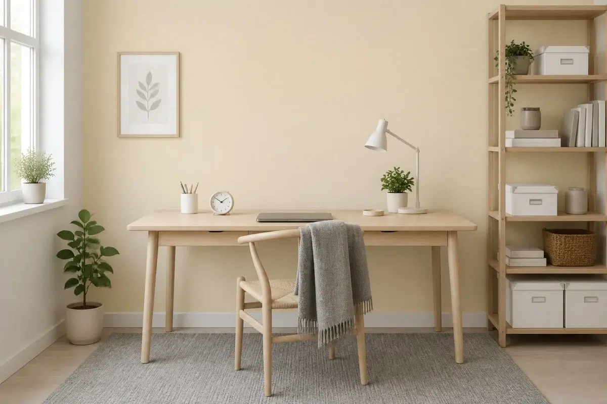
Chamomile (6399) can change noticeably under daylight beside desk lamps and screen glow. Sample it beside the finishes that will remain in the room.

Sherwin-Williams Chamomile in a scandinavian home office
@mybudgetrecipes
1 Bathroom Photo
In a compact setting where tile, fixtures and color sit close together, the most interesting quality of Chamomile (6399) may be the way it responds to tile, stone, glass, timber and metal fixtures. The beige, yellow hue classifications suggest the subtle directions the color may take as the room changes.

Chamomile — modern luxury bathroom
@mybudgetrecipes
1 Living Room Photo
In a space shaped by conversation, quiet evenings and changing daylight, the most interesting quality of Chamomile (6399) may be the way it responds to upholstery, timber, art and metal accents. The beige, yellow hue classifications suggest the subtle directions the color may take as the room changes.

A minimalist living room painted in Chamomile
@mybudgetrecipes
1 Mudroom Photo
The daily movement of arrivals, departures and changing weather can draw different notes from Chamomile (6399). The beige, yellow hue classifications suggest the subtle directions the color may take as the room changes.

Chamomile paint in a traditional mudroom
@mybudgetrecipes
1 Patio Photo
Chamomile (6399) brings its yellow character into an outdoor room surrounded by sky, planting and open light. Its brighter saturation allows the hue to remain present rather than fading quietly into the background.

contemporary patio featuring Chamomile by Sherwin-Williams
@mybudgetrecipes
1 House Photo
Against roofing, masonry, timber, planting and trim, Chamomile (6399) may feel quieter, sharper or more atmospheric than the digital swatch alone. Its LRV of 74.7 gives it a light-reflective character, though shadows and neighboring finishes can still draw out surprising depth.

Chamomile color — transitional house inspiration
@mybudgetrecipes
1 Kitchen Photo
The changing light from breakfast through dinner can draw different notes from Chamomile (6399). The beige, yellow hue classifications suggest the subtle directions the color may take as the room changes.

Chamomile — classy kitchen
@mybudgetrecipes
Expert Perspectives
Articles and features from across our network of home and design sites.
Coordinating Colors


A 9-point LRV gap (84 vs 75) makes Pure White the marginally brighter of the two.


At LRV 75 vs 10, Chamomile is decisively the brighter choice.
Trim Color
A 9-point LRV gap (84 vs 75) makes Pure White the marginally brighter of the two.
Similar Colors


Their light reflectance is nearly identical (LRV 75 vs 74), so neither reads brighter in a room.


Their light reflectance is nearly identical (LRV 75 vs 75), so neither reads brighter in a room.


With LRVs of 75 and 75, the two reflect almost the same amount of light.


With LRVs of 75 and 74, the two reflect almost the same amount of light.


With LRVs of 76 and 75, the two reflect almost the same amount of light.

A 8-point LRV gap (83 vs 75) makes Lemon Meringue the marginally brighter of the two.


Fresh Zest reads slightly lighter (LRV 82 vs 75), a gap that shows most in low-lit rooms.


With LRVs of 75 and 72, the two reflect almost the same amount of light.


Morning Sun reads slightly lighter (LRV 80 vs 75), a gap that shows most in low-lit rooms.
Complementary Colors


At LRV 75 vs 7, Chamomile is decisively the brighter choice.


A 6-point LRV gap (75 vs 69) makes Chamomile the marginally brighter of the two.


Chamomile reflects far more light (LRV 75 vs 20), opening up a space where Soulful Blue encloses it.


Chamomile reflects far more light (LRV 75 vs 28), opening up a space where Dusty Heather encloses it.


At LRV 75 vs 3, Chamomile is decisively the brighter choice.

Lavender Wisp reads slightly lighter (LRV 83 vs 75), a gap that shows most in low-lit rooms.


At LRV 75 vs 6, Chamomile is decisively the brighter choice.
Lighter Colors
With LRVs of 75 and 74, the two reflect almost the same amount of light.


A 11-point LRV gap (86 vs 75) makes Westhighland White the marginally brighter of the two.


Classic Light Buff reads slightly lighter (LRV 83 vs 75), a gap that shows most in low-lit rooms.


A 8-point LRV gap (83 vs 75) makes Dover White the marginally brighter of the two.


Restful White reads slightly lighter (LRV 81 vs 75), a gap that shows most in low-lit rooms.
Darker Colors


At LRV 75 vs 62, Chamomile is decisively the brighter choice.

A 9-point LRV gap (75 vs 66) makes Chamomile the marginally brighter of the two.


Chamomile reflects far more light (LRV 75 vs 50), opening up a space where Independent Gold encloses it.

Chamomile reflects far more light (LRV 75 vs 59), opening up a space where Straw Harvest encloses it.

Color Codes
Manufacturer description
This bright, cheerful yellow radiates the gentle warmth of chamomile tea at golden hour, inviting calm and comfort into any sun-filled room. Its high saturation and luminous quality make it perfect for kitchens, nurseries, or reading nooks where you want to cultivate a sense of optimism and ease.
Attributed to Sherwin-Williams catalog data.