
Citronella
Sherwin-Williams Citronella (6915) carries the measured structure of its color data and the less predictable beauty of paint in a finished space. Its beige and yellow classifications hint at the directions it may take as daylight, lamps and neighboring colors move around it. The manufacturer's description below offers one reading; the room imagery leaves space for your own.
Hex
#CBA901LRV
41.33
Citronella's Color Strip
Citronella is the seventh shade on this 7-color strip, the deepest shade in this coordinated family. Browsing strip 138 alongside this color helps you gauge whether to go lighter, darker, or stay right here.


Citronella in Rooms
Follow Citronella from one space to another and watch how light, scale and surrounding materials reshape its character. 10 generated visualizations explore how the color might shape a finished room.
1 Bathroom Photo
Citronella (6915) brings its yellow character into a compact setting where tile, fixtures and color sit close together. Its brighter saturation allows the hue to remain present rather than fading quietly into the background.
Citronella — japandi bathroom
@mybudgetrecipes
1 Dining Room Photo
Across 1 dining room image, Citronella (6915) meets natural light, candles and pendant lighting. Its warm classification can feel inviting beside tactile, natural materials.

Citronella paint in a minimalist dining room
@mybudgetrecipes
1 Front Door Photo
These 1 front door image show how Citronella (6915) can sit beside hardware, glazing, masonry, timber and surrounding trim. The beige, yellow hue classifications suggest the subtle directions the color may take as the room changes.

rustic modern front door featuring Citronella by Sherwin-Williams
@mybudgetrecipes
1 Bedroom Photo
The 1 bedroom image turn a yellow swatch into something more spatial and expressive. Its brighter saturation allows the hue to remain present rather than fading quietly into the background.

A cozy bedroom painted in Citronella
@mybudgetrecipes
1 Home Office Photo
Viewed across 1 home office image in a focused room balancing work, concentration and comfort, Citronella (6915) reveals how much color depends on scale, surface and shadow. An LRV of 41.3 lets the color hold its identity across both brighter and more shaded parts of the room.

Sherwin-Williams Citronella in a minimalist home office
@mybudgetrecipes
1 Living Room Photo
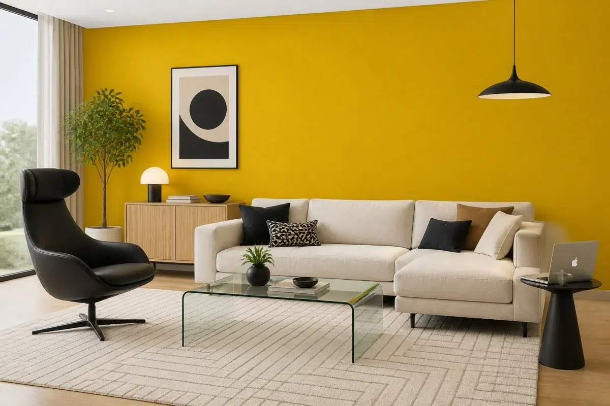
Across 1 living room image, Citronella (6915) meets the movement from window light to lamplight. Its warm classification can feel inviting beside tactile, natural materials.

A contemporary living room painted in Citronella
@mybudgetrecipes
1 Kitchen Photo
Citronella (6915) offers a starting mood rather than a finished formula: Its warm classification can feel inviting beside tactile, natural materials. Test it under daylight, task lighting and evening pendants.

Citronella — earthy kitchen
@mybudgetrecipes
1 House Photo
Citronella (6915) moves through 1 house image without becoming a fixed prescription for the room. Its warm classification can feel inviting beside tactile, natural materials.

Citronella color — coastal house inspiration
@mybudgetrecipes
1 Patio Photo
1 patio image trace Citronella (6915) through the broad shift from bright afternoon to dusk. Its place within 2017 Intrepid hints at the range of palettes it can inhabit.

rustic modern patio featuring Citronella by Sherwin-Williams
@mybudgetrecipes
1 Mudroom Photo
1 mudroom image place Citronella (6915) in a practical threshold where the outdoors enters the home. An LRV of 41.3 lets the color hold its identity across both brighter and more shaded parts of the room.

Citronella — small mudroom
@mybudgetrecipes
Expert Perspectives
Articles and features from across our network of home and design sites.
Coordinating Colors


At LRV 84 vs 41, Pure White is decisively the brighter choice.


At LRV 72 vs 41, Oyster White is decisively the brighter choice.


Citronella reflects far more light (LRV 41 vs 20), opening up a space where Mink encloses it.
Trim Color
At LRV 84 vs 41, Pure White is decisively the brighter choice.
Similar Colors


Eye Catching reads slightly lighter (LRV 50 vs 41), a gap that shows most in low-lit rooms.


Their light reflectance is nearly identical (LRV 41 vs 41), so neither reads brighter in a room.


With LRVs of 44 and 41, the two reflect almost the same amount of light.


A 5-point LRV gap (47 vs 41) makes Humorous Green the marginally brighter of the two.


Their light reflectance is nearly identical (LRV 41 vs 39), so neither reads brighter in a room.


Gambol Gold reads slightly lighter (LRV 48 vs 41), a gap that shows most in low-lit rooms.


Citronella reads slightly lighter (LRV 41 vs 35), a gap that shows most in low-lit rooms.


A 10-point LRV gap (41 vs 31) makes Citronella the marginally brighter of the two.
Complementary Colors


Citronella reflects far more light (LRV 41 vs 8), opening up a space where Frank Blue encloses it.
Lighter Colors


At LRV 55 vs 41, Goldfinch is decisively the brighter choice.


Confident Yellow reflects far more light (LRV 64 vs 41), opening up a space where Citronella encloses it.


At LRV 63 vs 41, Cheerful is decisively the brighter choice.


At LRV 61 vs 41, Citrus is decisively the brighter choice.


Forsythia reflects far more light (LRV 63 vs 41), opening up a space where Citronella encloses it.
Color Codes
Manufacturer description
This vibrant medium yellow practically hums with warmth and energy, evoking the cheerful glow of summer afternoons and sun-warmed garden paths. Perfect for kitchens, playrooms, or accent walls, its bright saturation commands attention while its golden undertones keep the mood inviting rather than harsh.