
Coming Up Roses
Sherwin-Williams's Coming Up Roses is a red shade whose quieter details emerge through comparison. Its pink and red classifications hint at the directions it may take as daylight, lamps and neighboring colors move around it. 10 generated visualizations explore how the color might shape a finished room.
Hex
#DD7788LRV
30.25
Coming Up Roses's Color Strip
Coming Up Roses is the fourth shade on this 7-color strip, sitting between Cheery and Eros Pink. The strip spans from Impatiens Petal at the lightest end to Valentine at the deepest. Strip 105 puts these related shades in sequence, making it simple to find the tone that suits your room.

Coming Up Roses in Rooms
Follow Coming Up Roses from one space to another and watch how light, scale and surrounding materials reshape its character. 10 generated visualizations explore how the color might shape a finished room.
1 Bedroom Photo
1 bedroom image place Coming Up Roses (6585) in a room designed around rest, softness and retreat. An LRV of 30.3 lets the color hold its identity across both brighter and more shaded parts of the room.
A moody bedroom painted in Coming Up Roses
@mybudgetrecipes
1 Home Office Photo
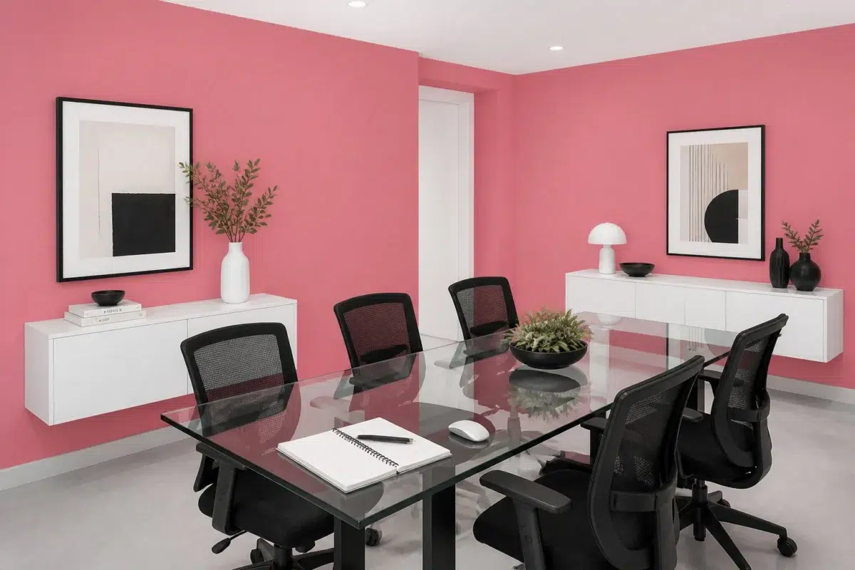
Coming Up Roses (6585) offers a starting mood rather than a finished formula: Its warm classification can feel inviting beside tactile, natural materials. Test it under daylight beside desk lamps and screen glow.

Sherwin-Williams Coming Up Roses in a neutral home office
@mybudgetrecipes
1 Dining Room Photo
Coming Up Roses (6585) moves through 1 dining room image without becoming a fixed prescription for the room. Its warm classification can feel inviting beside tactile, natural materials.

Coming Up Roses paint in a contemporary dining room
@mybudgetrecipes
1 Bathroom Photo
These 1 bathroom image show how Coming Up Roses (6585) can sit beside tile, stone, glass, timber and metal fixtures. The pink, red hue classifications suggest the subtle directions the color may take as the room changes.

Coming Up Roses — modern luxury bathroom
@mybudgetrecipes
1 Front Door Photo
1 generated visualization explores how the color might shape the finished space. Together they show Coming Up Roses (6585) as inspiration rather than a promise of an identical result.

stylish front door featuring Coming Up Roses by Sherwin-Williams
@mybudgetrecipes
1 Kitchen Photo
Viewed across 1 kitchen image in a hardworking room where color meets movement and strong surfaces, Coming Up Roses (6585) reveals how much color depends on scale, surface and shadow. An LRV of 30.3 lets the color hold its identity across both brighter and more shaded parts of the room.

Coming Up Roses — modern luxury kitchen
@mybudgetrecipes
1 Patio Photo
These 1 patio image show how Coming Up Roses (6585) can sit beside stone, timber, metal, textiles and greenery. The pink, red hue classifications suggest the subtle directions the color may take as the room changes.

boho patio featuring Coming Up Roses by Sherwin-Williams
@mybudgetrecipes
1 House Photo
These 1 house image show how Coming Up Roses (6585) can sit beside roofing, masonry, timber, planting and trim. The pink, red hue classifications suggest the subtle directions the color may take as the room changes.

Coming Up Roses color — traditional house inspiration
@mybudgetrecipes
1 Mudroom Photo
Across 1 mudroom image, Coming Up Roses (6585) meets doorway light and the softer illumination of an internal passage. Its warm classification can feel inviting beside tactile, natural materials.

Coming Up Roses paint in a earthy mudroom
@mybudgetrecipes
1 Living Room Photo
The room’s shift from daytime energy to evening calm can draw different notes from Coming Up Roses (6585). The pink, red hue classifications suggest the subtle directions the color may take as the room changes.

Coming Up Roses — scandinavian living room
@mybudgetrecipes
Expert Perspectives
Articles and features from across our network of home and design sites.
Coordinating Colors


At LRV 84 vs 30, Ibis White is decisively the brighter choice.


At LRV 75 vs 30, Porcelain is decisively the brighter choice.


At LRV 59 vs 30, Jazz Age Coral is decisively the brighter choice.
Trim Color
At LRV 84 vs 30, Ibis White is decisively the brighter choice.
Similar Colors

Their light reflectance is nearly identical (LRV 31 vs 30), so neither reads brighter in a room.

Their light reflectance is nearly identical (LRV 30 vs 30), so neither reads brighter in a room.

Coming Up Roses reads slightly lighter (LRV 30 vs 26), a gap that shows most in low-lit rooms.


With LRVs of 32 and 30, the two reflect almost the same amount of light.


A 5-point LRV gap (30 vs 26) makes Coming Up Roses the marginally brighter of the two.


A 4-point LRV gap (30 vs 26) makes Coming Up Roses the marginally brighter of the two.


Memorable Rose reads slightly lighter (LRV 33 vs 30), a gap that shows most in low-lit rooms.


Jaipur Pink reads slightly lighter (LRV 40 vs 30), a gap that shows most in low-lit rooms.


Coming Up Roses reads slightly lighter (LRV 30 vs 23), a gap that shows most in low-lit rooms.


Cheery reads slightly lighter (LRV 41 vs 30), a gap that shows most in low-lit rooms.
Complementary Colors


Faraway Blue reflects far more light (LRV 84 vs 30), opening up a space where Coming Up Roses encloses it.


Sky High reflects far more light (LRV 78 vs 30), opening up a space where Coming Up Roses encloses it.


A 8-point LRV gap (30 vs 22) makes Coming Up Roses the marginally brighter of the two.


At LRV 55 vs 30, Aloe is decisively the brighter choice.


Brooklet reflects far more light (LRV 85 vs 30), opening up a space where Coming Up Roses encloses it.


Coming Up Roses reflects far more light (LRV 30 vs 14), opening up a space where Raging Sea encloses it.


At LRV 79 vs 30, Carefree is decisively the brighter choice.
Lighter Colors
With LRVs of 32 and 30, the two reflect almost the same amount of light.

At LRV 66 vs 30, Reverie Pink is decisively the brighter choice.


Azalea Flower reflects far more light (LRV 61 vs 30), opening up a space where Coming Up Roses encloses it.
Jaipur Pink reads slightly lighter (LRV 40 vs 30), a gap that shows most in low-lit rooms.

Loveable reflects far more light (LRV 61 vs 30), opening up a space where Coming Up Roses encloses it.
Darker Colors


At LRV 30 vs 17, Coming Up Roses is decisively the brighter choice.
A 5-point LRV gap (30 vs 26) makes Coming Up Roses the marginally brighter of the two.
Color Codes
Manufacturer description
This warm, saturated red blooms with coral undertones that evoke the romantic flush of a garden in full splendor, radiating energy and passion without overwhelming a space. Perfect for dining rooms, accent walls, or powder rooms where you want to create an intimate gathering place that feels both bold and inviting.