
Composed
Sherwin-Williams's Composed is a blue shade whose quieter details emerge through comparison. Its midtone saturation balances color with restraint, so the hue can register without overwhelming nearby finishes. 10 generated visualizations explore how the color might shape a finished room.
Hex
#7EA298LRV
32.55
Composed's Color Strip
Composed is the fourth shade on this 7-color strip, sitting between Vintage Vessel and Surf Green. The strip spans from Waterscape at the lightest end to Country Squire at the deepest. Strip 169 puts these related shades in sequence, making it simple to find the tone that suits your room.


Composed in Rooms
Follow Composed from one space to another and watch how light, scale and surrounding materials reshape its character. 10 generated visualizations explore how the color might shape a finished room.
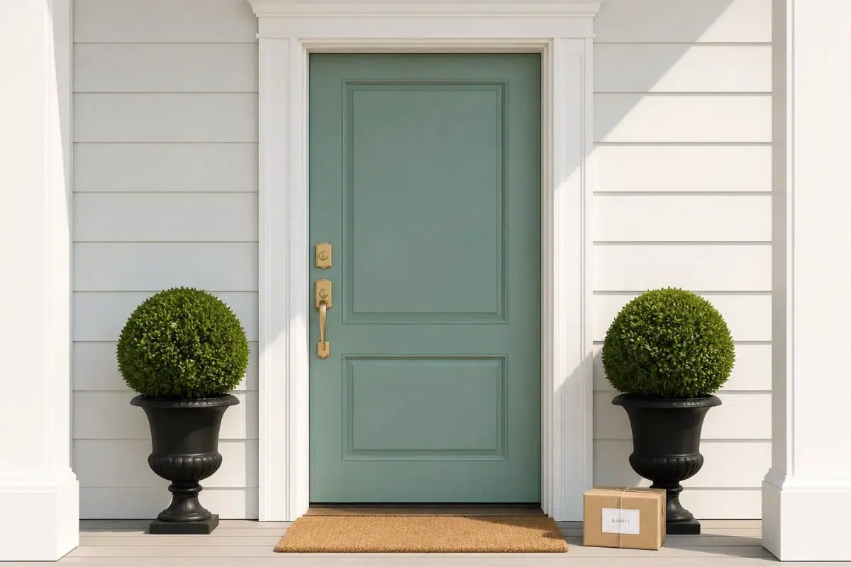
1 Front Door Photo
Viewed across 1 front door image in a small architectural moment with an outsized first impression, Composed (6472) reveals how much color depends on scale, surface and shadow. An LRV of 32.5 lets the color hold its identity across both brighter and more shaded parts of the room.
classy front door featuring Composed by Sherwin-Williams
@mybudgetrecipes
1 Dining Room Photo
Viewed across 1 dining room image in a gathering space that can move from daylight to ceremony, Composed (6472) reveals how much color depends on scale, surface and shadow. An LRV of 32.5 lets the color hold its identity across both brighter and more shaded parts of the room.

Composed paint in a elegant dining room
@mybudgetrecipes
1 Bathroom Photo
1 generated visualization explores how the color might shape the finished space. Together they show Composed (6472) as inspiration rather than a promise of an identical result.

Composed — industrial bathroom
@mybudgetrecipes
1 Home Office Photo
1 generated visualization explores how the color might shape the finished space. Together they show Composed (6472) as inspiration rather than a promise of an identical result.

Sherwin-Williams Composed in a industrial home office
@mybudgetrecipes
1 Bedroom Photo
Composed (6472) moves through 1 bedroom image without becoming a fixed prescription for the room. Its cool classification can bring a composed, clean tension to warmer finishes.

A minimalist bedroom painted in Composed
@mybudgetrecipes
1 Kitchen Photo
Composed (6472) can change noticeably under daylight, task lighting and evening pendants. Sample it beside the finishes that will remain in the room.

Composed — modern luxury kitchen
@mybudgetrecipes
1 Patio Photo
1 patio image trace Composed (6472) through the broad shift from bright afternoon to dusk. The blue, green hue classifications suggest the subtle directions the color may take as the room changes.

aesthetic patio featuring Composed by Sherwin-Williams
@mybudgetrecipes
1 Mudroom Photo
Composed (6472) offers a starting mood rather than a finished formula: Its cool classification can bring a composed, clean tension to warmer finishes. Test it under doorway light and the softer illumination of an internal passage.

Composed paint in a small mudroom
@mybudgetrecipes
1 Living Room Photo
In a space shaped by conversation, quiet evenings and changing daylight, the most interesting quality of Composed (6472) may be the way it responds to upholstery, timber, art and metal accents. The blue, green hue classifications suggest the subtle directions the color may take as the room changes.

A organic modern living room painted in Composed
@mybudgetrecipes
1 House Photo
The façade’s movement through sun, shade and season can draw different notes from Composed (6472). The blue, green hue classifications suggest the subtle directions the color may take as the room changes.

Composed color — rustic modern house inspiration
@mybudgetrecipes
Expert Perspectives
Articles and features from across our network of home and design sites.
Coordinating Colors


At LRV 75 vs 33, Green Trance is decisively the brighter choice.


Shell White reflects far more light (LRV 83 vs 33), opening up a space where Composed encloses it.


Composed reflects far more light (LRV 33 vs 6), opening up a space where Charcoal Blue encloses it.
Trim Color
At LRV 75 vs 33, Green Trance is decisively the brighter choice.
Similar Colors

Their light reflectance is nearly identical (LRV 34 vs 33), so neither reads brighter in a room.


Their light reflectance is nearly identical (LRV 33 vs 30), so neither reads brighter in a room.


Composed reads slightly lighter (LRV 33 vs 28), a gap that shows most in low-lit rooms.


A 8-point LRV gap (41 vs 33) makes Vintage Vessel the marginally brighter of the two.


Burma Jade reads slightly lighter (LRV 40 vs 33), a gap that shows most in low-lit rooms.


Their light reflectance is nearly identical (LRV 33 vs 32), so neither reads brighter in a room.
Complementary Colors

At LRV 79 vs 33, Whimsical White is decisively the brighter choice.


Chaise Mauve reflects far more light (LRV 46 vs 33), opening up a space where Composed encloses it.

Composed reads slightly lighter (LRV 33 vs 24), a gap that shows most in low-lit rooms.

At LRV 33 vs 17, Composed is decisively the brighter choice.


At LRV 64 vs 33, Wallflower is decisively the brighter choice.


Lighter Colors
A 8-point LRV gap (41 vs 33) makes Vintage Vessel the marginally brighter of the two.


Darker Colors


Composed reads slightly lighter (LRV 33 vs 21), a gap that shows most in low-lit rooms.
Color Codes
Manufacturer description
Find balance with this mid-tone blue-green. A hue with complex character, you can expect personality and warmth to follow it.