
Copper Pot
Sherwin-Williams Copper Pot (7709) carries the measured structure of its color data and the less predictable beauty of paint in a finished space. Its warm classification can bring a gentle glow to the color, particularly beside natural wood and softer whites. Move between the room imagery, color measurements and coordinating shades to build a fuller sense of how it might live in your space.
Hex
#B16A37LRV
19.90
Copper Pot's Color Strip
Copper Pot is the seventh shade on this 7-color strip, the deepest shade in this coordinated family. Browsing strip 128 alongside this color helps you gauge whether to go lighter, darker, or stay right here.


Copper Pot in Rooms
Follow Copper Pot from one space to another and watch how light, scale and surrounding materials reshape its character. 10 generated visualizations explore how the color might shape a finished room.
1 Bathroom Photo
The 1 bathroom image turn a orange swatch into something more spatial and expressive. Its midtone saturation keeps the color expressive without letting it dominate every surface around it.
Copper Pot — japandi bathroom
@mybudgetrecipes
1 Home Office Photo
1 home office image place Copper Pot (7709) in a focused room balancing work, concentration and comfort. An LRV of 19.9 lets the color hold its identity across both brighter and more shaded parts of the room.

Sherwin-Williams Copper Pot in a mid century home office
@mybudgetrecipes
1 Bedroom Photo
Across 1 bedroom image, Copper Pot (7709) meets gentle morning light and low evening lamps. Its warm classification can feel inviting beside tactile, natural materials.

A modern luxury bedroom painted in Copper Pot
@mybudgetrecipes
1 Dining Room Photo
These 1 dining room image show how Copper Pot (7709) can sit beside timber, table linen, glass and artwork. The beige hue classifications suggest the subtle directions the color may take as the room changes.

Copper Pot paint in a mid century dining room
@mybudgetrecipes
1 Front Door Photo
Copper Pot (7709) brings its orange character into a small architectural moment with an outsized first impression. Its midtone saturation keeps the color expressive without letting it dominate every surface around it.

rustic modern front door featuring Copper Pot by Sherwin-Williams
@mybudgetrecipes
1 Mudroom Photo
The daily movement of arrivals, departures and changing weather can draw different notes from Copper Pot (7709). The beige hue classifications suggest the subtle directions the color may take as the room changes.

Copper Pot paint in a tiny mudroom
@mybudgetrecipes
1 Kitchen Photo
The beige hue classifications suggest the subtle directions the color may take as the room changes. In this setting, let daylight, task lighting and evening pendants and stone, timber, tile and metal finishes guide the final sample decision.

Copper Pot — classy kitchen
@mybudgetrecipes
1 Patio Photo
The beige hue classifications suggest the subtle directions the color may take as the room changes. In this setting, let direct sun, reflected daylight and deep exterior shade and stone, timber, metal, textiles and greenery guide the final sample decision.

industrial patio featuring Copper Pot by Sherwin-Williams
@mybudgetrecipes
1 Living Room Photo
The beige hue classifications suggest the subtle directions the color may take as the room changes. In this setting, let the movement from window light to lamplight and upholstery, timber, art and metal accents guide the final sample decision.

A industrial living room painted in Copper Pot
@mybudgetrecipes
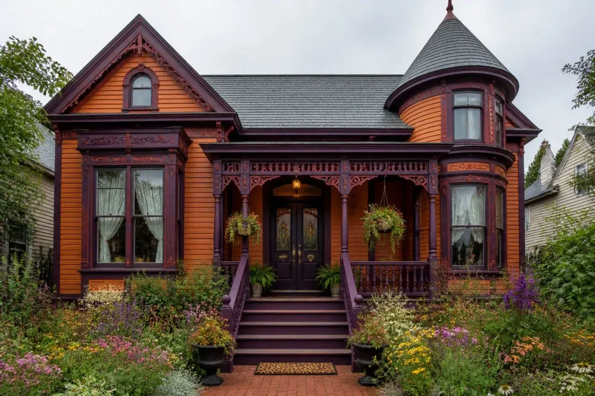
1 House Photo
1 house image place Copper Pot (7709) in an exterior viewed across distance, weather and the changing sky. An LRV of 19.9 lets the color hold its identity across both brighter and more shaded parts of the room.

Copper Pot color — maximalist house inspiration
@mybudgetrecipes
Expert Perspectives
Articles and features from across our network of home and design sites.
Coordinating Colors


At LRV 80 vs 20, Eggwhite is decisively the brighter choice.


At LRV 66 vs 20, Natural Linen is decisively the brighter choice.


Copper Pot reflects far more light (LRV 20 vs 8), opening up a space where Perle Noir encloses it.
Trim Color
At LRV 80 vs 20, Eggwhite is decisively the brighter choice.
Similar Colors


With LRVs of 20 and 20, the two reflect almost the same amount of light.

Their light reflectance is nearly identical (LRV 21 vs 20), so neither reads brighter in a room.

Their light reflectance is nearly identical (LRV 23 vs 20), so neither reads brighter in a room.

Yam reads slightly lighter (LRV 23 vs 20), a gap that shows most in low-lit rooms.

A 4-point LRV gap (24 vs 20) makes Tigereye the marginally brighter of the two.


With LRVs of 20 and 19, the two reflect almost the same amount of light.


With LRVs of 20 and 17, the two reflect almost the same amount of light.


A 3-point LRV gap (20 vs 17) makes Copper Pot the marginally brighter of the two.


Their light reflectance is nearly identical (LRV 22 vs 20), so neither reads brighter in a room.

With LRVs of 20 and 20, the two reflect almost the same amount of light.
Complementary Colors


At LRV 38 vs 20, Meditative is decisively the brighter choice.


A 7-point LRV gap (20 vs 13) makes Copper Pot the marginally brighter of the two.


A 9-point LRV gap (29 vs 20) makes Poolhouse the marginally brighter of the two.


Daydream reflects far more light (LRV 54 vs 20), opening up a space where Copper Pot encloses it.

White Iris reflects far more light (LRV 76 vs 20), opening up a space where Copper Pot encloses it.


Vesper Violet reflects far more light (LRV 35 vs 20), opening up a space where Copper Pot encloses it.


A 5-point LRV gap (20 vs 15) makes Copper Pot the marginally brighter of the two.
Lighter Colors


A 7-point LRV gap (27 vs 20) makes Chrysanthemum the marginally brighter of the two.


A 8-point LRV gap (28 vs 20) makes Armagnac the marginally brighter of the two.

A 9-point LRV gap (29 vs 20) makes Rookwood Amber the marginally brighter of the two.


Subdued Sienna reads slightly lighter (LRV 32 vs 20), a gap that shows most in low-lit rooms.
With LRVs of 20 and 20, the two reflect almost the same amount of light.
Darker Colors
A 3-point LRV gap (20 vs 17) makes Copper Pot the marginally brighter of the two.
Color Codes
Manufacturer description
This warm, earthy orange wrapped in russet undertones conjures the glow of autumn kitchens and the comfort of well-loved copper cookware. Perfect for dining rooms or accent walls, it grounds a space with both warmth and understated sophistication.