
Corallite
Corallite begins as a orange color on paper, then shifts with every surface, shadow and neighboring material. Its warm classification can bring a gentle glow to the color, particularly beside natural wood and softer whites. The manufacturer's description below offers one reading; the room imagery leaves space for your own.
Hex
#F0DFCDLRV
75.67
Corallite in Rooms
Follow Corallite from one space to another and watch how light, scale and surrounding materials reshape its character. 10 generated visualizations explore how the color might shape a finished room.
1 Bathroom Photo
1 bathroom image trace Corallite (9698) through the contrast between bright mornings and quieter evening light. Its place within Emerald Designer Edition - Classic + Collected hints at the range of palettes it can inhabit.
Corallite — minimalist bathroom
@mybudgetrecipes
1 Bedroom Photo
1 generated visualization explores how the color might shape the finished space. Together they show Corallite (9698) as inspiration rather than a promise of an identical result.

A moody bedroom painted in Corallite
@mybudgetrecipes
1 Home Office Photo
Against wood, paper, shelving and upholstered seating, Corallite (9698) may feel quieter, sharper or more atmospheric than the digital swatch alone. Its LRV of 75.7 gives it a light-reflective character, though shadows and neighboring finishes can still draw out surprising depth.

Sherwin-Williams Corallite in a moody home office
@mybudgetrecipes
1 Dining Room Photo
Corallite (9698) can change noticeably under natural light, candles and pendant lighting. Sample it beside the finishes that will remain in the room.

Corallite paint in a boho dining room
@mybudgetrecipes
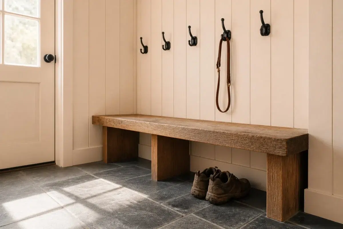
1 Mudroom Photo
1 generated visualization explores how the color might shape the finished space. Together they show Corallite (9698) as inspiration rather than a promise of an identical result.

Corallite paint in a rustic modern mudroom
@mybudgetrecipes
1 Living Room Photo
In a space shaped by conversation, quiet evenings and changing daylight, the most interesting quality of Corallite (9698) may be the way it responds to upholstery, timber, art and metal accents. The beige hue classifications suggest the subtle directions the color may take as the room changes.

A mid century living room painted in Corallite
@mybudgetrecipes
1 Kitchen Photo
Across 1 kitchen image, Corallite (9698) meets daylight, task lighting and evening pendants. Its warm classification can feel inviting beside tactile, natural materials.

Corallite — minimalist kitchen
@mybudgetrecipes
1 Patio Photo
Its place within Emerald Designer Edition - Classic + Collected hints at the range of palettes it can inhabit. In this setting, let direct sun, reflected daylight and deep exterior shade and stone, timber, metal, textiles and greenery guide the final sample decision.

mediterranean patio featuring Corallite by Sherwin-Williams
@mybudgetrecipes
1 House Photo
Corallite (9698) moves through 1 house image without becoming a fixed prescription for the room. Its warm classification can feel inviting beside tactile, natural materials.

Corallite color — rustic modern house inspiration
@mybudgetrecipes
1 Front Door Photo
Corallite (9698) offers a starting mood rather than a finished formula: Its warm classification can feel inviting beside tactile, natural materials. Test it under direct sun, porch shade and evening exterior light.

Corallite — modern luxury front door
@mybudgetrecipes
Expert Perspectives
Articles and features from across our network of home and design sites.
Coordinating Colors


Corallite reflects far more light (LRV 76 vs 16), opening up a space where Hulett Ore encloses it.
Similar Colors


Their light reflectance is nearly identical (LRV 77 vs 76), so neither reads brighter in a room.


With LRVs of 76 and 74, the two reflect almost the same amount of light.


Their light reflectance is nearly identical (LRV 77 vs 76), so neither reads brighter in a room.


Melon Tint reads slightly lighter (LRV 82 vs 76), a gap that shows most in low-lit rooms.


Corallite reads slightly lighter (LRV 76 vs 70), a gap that shows most in low-lit rooms.


Complementary Colors


At LRV 76 vs 15, Corallite is decisively the brighter choice.


Corallite reflects far more light (LRV 76 vs 25), opening up a space where Bracing Blue encloses it.


Corallite reflects far more light (LRV 76 vs 45), opening up a space where Languid Blue encloses it.


Lighter Colors


With LRVs of 78 and 76, the two reflect almost the same amount of light.

With LRVs of 76 and 75, the two reflect almost the same amount of light.
Their light reflectance is nearly identical (LRV 77 vs 76), so neither reads brighter in a room.


Frost Bite reflects far more light (LRV 88 vs 76), opening up a space where Corallite encloses it.
Darker Colors

Corallite reflects far more light (LRV 76 vs 46), opening up a space where New Colonial Yellow encloses it.


Corallite reflects far more light (LRV 76 vs 46), opening up a space where Golden Gate encloses it.


Corallite reads slightly lighter (LRV 76 vs 72), a gap that shows most in low-lit rooms.


At LRV 76 vs 46, Corallite is decisively the brighter choice.


Corallite reflects far more light (LRV 76 vs 53), opening up a space where Cupola Yellow encloses it.
Color Codes
Manufacturer description
This luminous peachy-orange glows with the warmth of golden hour light, casting a gentle, uplifting energy perfect for kitchens and sunrooms where you want to inspire conversation. Its soft coral undertones create an inviting, almost translucent quality that pairs beautifully with crisp whites and warm wood accents.
Attributed to Sherwin-Williams catalog data.