
Cote D'Azur
There is more to Sherwin-Williams Cote D'Azur (6951) than the swatch alone: its depth, undertones and setting all shape the final impression. Its LRV of 14.9 gives it real visual weight, allowing the color to hold a wall rather than simply recede from view. Its related shades below reveal where the color harmonizes—and where contrast brings it fully to life.
Hex
#017C85LRV
14.90
Cote D'Azur in Rooms
Follow Cote D'Azur from one space to another and watch how light, scale and surrounding materials reshape its character. 10 generated visualizations explore how the color might shape a finished room.
1 Bathroom Photo
1 generated visualization explores how the color might shape the finished space. Together they show Cote D'Azur (6951) as inspiration rather than a promise of an identical result.
Cote D'Azur — modern luxury bathroom
@mybudgetrecipes
1 Front Door Photo
1 generated visualization explores how the color might shape the finished space. Together they show Cote D'Azur (6951) as inspiration rather than a promise of an identical result.

classy front door featuring Cote D'Azur by Sherwin-Williams
@mybudgetrecipes
1 Bedroom Photo
1 bedroom image place Cote D'Azur (6951) in a room designed around rest, softness and retreat. With an LRV of 14.9, it carries enough visual weight to make light, trim and texture feel especially deliberate.

A scandinavian bedroom painted in Cote D'Azur
@mybudgetrecipes
1 Home Office Photo
Cote D'Azur (6951) brings its blue character into a focused room balancing work, concentration and comfort. Its cool classification can bring a composed, clean tension to warmer finishes.

Sherwin-Williams Cote D'Azur in a contemporary home office
@mybudgetrecipes
1 Dining Room Photo
Across 1 dining room image, Cote D'Azur (6951) meets natural light, candles and pendant lighting. Its cool classification can bring a composed, clean tension to warmer finishes.

Cote D'Azur paint in a mid century dining room
@mybudgetrecipes
1 Living Room Photo
Cote D'Azur (6951) brings its blue character into a space shaped by conversation, quiet evenings and changing daylight. Its cool classification can bring a composed, clean tension to warmer finishes.

A elegant living room painted in Cote D'Azur
@mybudgetrecipes
1 House Photo
1 house image place Cote D'Azur (6951) in an exterior viewed across distance, weather and the changing sky. With an LRV of 14.9, it carries enough visual weight to make light, trim and texture feel especially deliberate.

Cote D'Azur color — coastal house inspiration
@mybudgetrecipes
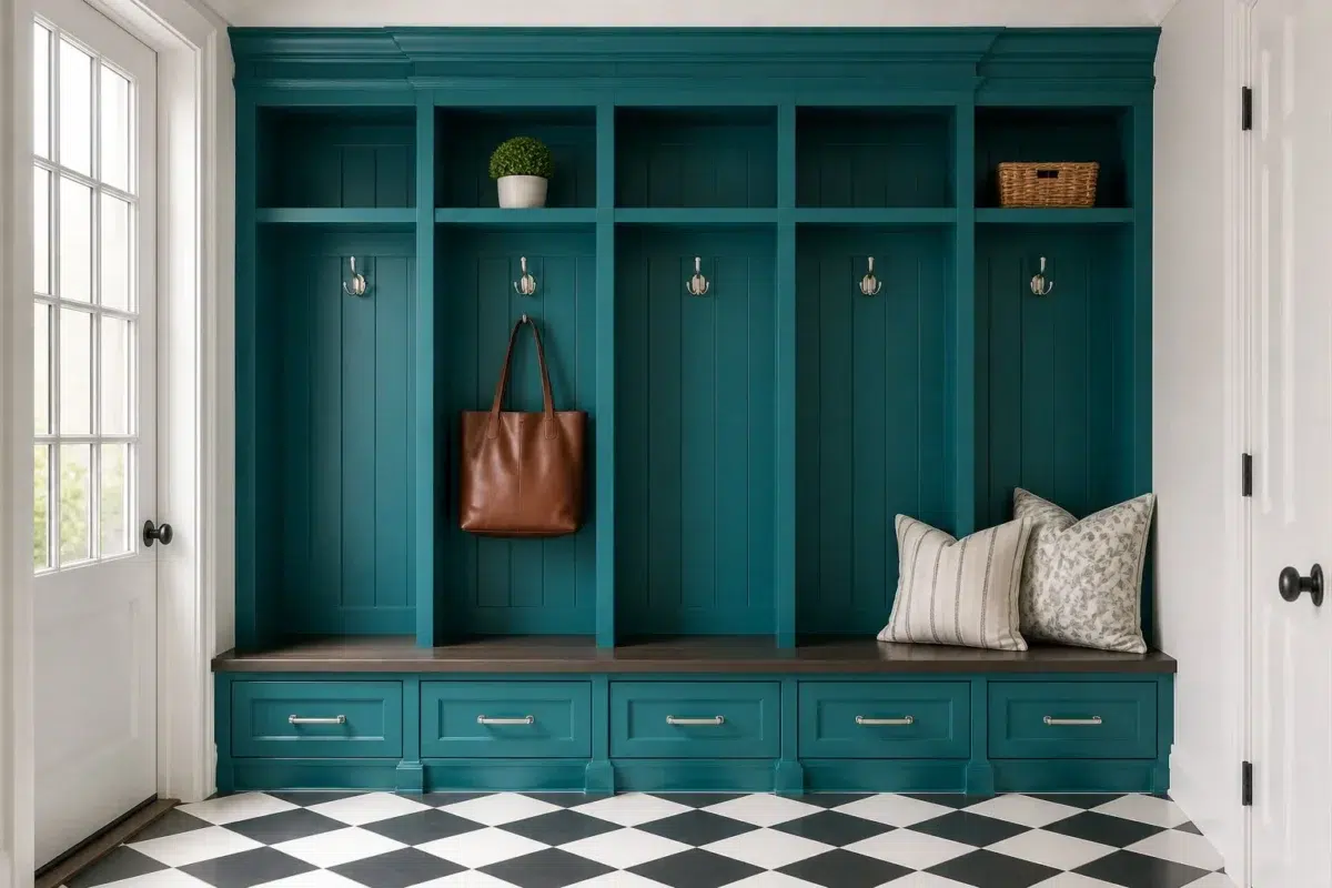
1 Mudroom Photo
Cote D'Azur (6951) moves through 1 mudroom image without becoming a fixed prescription for the room. Its cool classification can bring a composed, clean tension to warmer finishes.

Cote D'Azur paint in a classy mudroom
@mybudgetrecipes
1 Patio Photo
The broad shift from bright afternoon to dusk can draw different notes from Cote D'Azur (6951). The blue hue classifications suggest the subtle directions the color may take as the room changes.

boho patio featuring Cote D'Azur by Sherwin-Williams
@mybudgetrecipes
1 Kitchen Photo
These 1 kitchen image show how Cote D'Azur (6951) can sit beside stone, timber, tile and metal finishes. The blue hue classifications suggest the subtle directions the color may take as the room changes.

Cote D'Azur — vintage kitchen
@mybudgetrecipes
Expert Perspectives
Articles and features from across our network of home and design sites.
Coordinating Colors


At LRV 74 vs 15, Napery is decisively the brighter choice.


Afternoon reflects far more light (LRV 65 vs 15), opening up a space where Cote D'Azur encloses it.
Similar Colors


Their light reflectance is nearly identical (LRV 15 vs 14), so neither reads brighter in a room.


With LRVs of 17 and 15, the two reflect almost the same amount of light.


Gulfstream reads slightly lighter (LRV 18 vs 15), a gap that shows most in low-lit rooms.

With LRVs of 15 and 13, the two reflect almost the same amount of light.


With LRVs of 15 and 15, the two reflect almost the same amount of light.


With LRVs of 16 and 15, the two reflect almost the same amount of light.


Their light reflectance is nearly identical (LRV 15 vs 13), so neither reads brighter in a room.


Cruising reads slightly lighter (LRV 19 vs 15), a gap that shows most in low-lit rooms.

Tempo Teal reads slightly lighter (LRV 19 vs 15), a gap that shows most in low-lit rooms.
Complementary Colors


A 3-point LRV gap (18 vs 15) makes Raucous Orange the marginally brighter of the two.


Blushing reflects far more light (LRV 68 vs 15), opening up a space where Cote D'Azur encloses it.


Emberglow reflects far more light (LRV 29 vs 15), opening up a space where Cote D'Azur encloses it.


Copper Harbor reflects far more light (LRV 30 vs 15), opening up a space where Cote D'Azur encloses it.


At LRV 63 vs 15, Bella Pink is decisively the brighter choice.


With LRVs of 17 and 15, the two reflect almost the same amount of light.


A 5-point LRV gap (20 vs 15) makes Gladiola the marginally brighter of the two.
Lighter Colors


Nifty Turquoise reads slightly lighter (LRV 21 vs 15), a gap that shows most in low-lit rooms.


At LRV 27 vs 15, Biscay is decisively the brighter choice.


At LRV 29 vs 15, Surfer is decisively the brighter choice.


Splashy reads slightly lighter (LRV 21 vs 15), a gap that shows most in low-lit rooms.
Gulfstream reads slightly lighter (LRV 18 vs 15), a gap that shows most in low-lit rooms.
Darker Colors
Their light reflectance is nearly identical (LRV 15 vs 14), so neither reads brighter in a room.


Cote D'Azur reads slightly lighter (LRV 15 vs 10), a gap that shows most in low-lit rooms.
With LRVs of 15 and 13, the two reflect almost the same amount of light.
Their light reflectance is nearly identical (LRV 15 vs 13), so neither reads brighter in a room.

At LRV NaN vs NaN, Mosaic Tile is decisively the brighter choice.
Color Codes
Manufacturer description
Transport yourself to the cobalt shores of the French Riviera with this deep, cool blue steeped in maritime sophistication and timeless elegance. Perfect for creating an intimate sanctuary in bedrooms or studies, it pairs beautifully with crisp whites and warm wood accents to anchor a room with understated luxury.