
Creamy
Creamy is a White paint color from Sherwin-Williams, but its character reaches beyond a single label. Its beige classifications hint at the directions it may take as daylight, lamps and neighboring colors move around it. Treat the digital swatch as an opening note, then watch a physical sample from morning light through evening lamps.
Hex
#EFE8DBLRV
81.19
Creamy's Color Strip
Creamy is the third shade on this 7-color strip, sitting between Dover White and Aged White. The strip spans from Whitetail at the lightest end to Patience at the deepest. As part of strip 261, these colors are curated to work together — helpful when you're deciding how light or deep to go.


Creamy in Rooms
Follow Creamy from one space to another and watch how light, scale and surrounding materials reshape its character. 93 sourced room photos sit alongside 7 generated visualizations.
24 Living Room Photos
In a space shaped by conversation, quiet evenings and changing daylight, the most interesting quality of Creamy (7012) may be the way it responds to upholstery, timber, art and metal accents. The beige hue classifications suggest the subtle directions the color may take as the room changes.
Living room walls in Creamy create a serene, light-filled atmosphere.
@mybudgetrecipes
15 Bedroom Photos
Creamy (7012) moves through 15 bedroom images without becoming a fixed prescription for the room. Its warm classification can feel inviting beside tactile, natural materials.

Bedroom walls wrapped in Creamy establish a restful, cohesive backdrop.
@mybudgetrecipes
3 Kitchen Photos
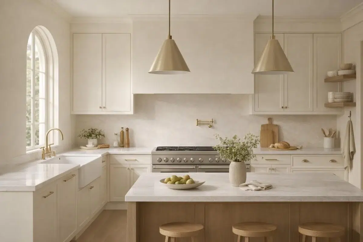
3 kitchen images place Creamy (7012) in a hardworking room where color meets movement and strong surfaces. Its LRV of 81.2 gives it a light-reflective character, though shadows and neighboring finishes can still draw out surprising depth.

Kitchen cabinets painted Creamy brighten the cooking space with soft warmth.
@mybudgetrecipes

Kitchen cabinets painted in Creamy create a warm, inviting cooking space.
@michellezawackirealestate

Cream-colored walls brighten this kitchen with soft, natural light.
@thegorillabrothers
6 Bathroom Photos
5 sourced photos are joined by 1 generated visualization, offering both observed and imagined settings. Together they show Creamy (7012) as inspiration rather than a promise of an identical result.

Bathroom walls in Creamy enhance the room's clean, spa-like quality.
@mybudgetrecipes
1 Home Office Photo
Against wood, paper, shelving and upholstered seating, Creamy (7012) may feel quieter, sharper or more atmospheric than the digital swatch alone. Its LRV of 81.2 gives it a light-reflective character, though shadows and neighboring finishes can still draw out surprising depth.

Desk and shelving in Creamy keep the home office calm and focused.
@mybudgetrecipes
21 House Photos
Creamy (7012) brings its white character into an exterior viewed across distance, weather and the changing sky. Its brighter saturation allows the hue to remain present rather than fading quietly into the background.

Exterior trim painted Creamy softens the home's overall architectural lines.
@mybudgetrecipes
1 Front Door Photo
In a small architectural moment with an outsized first impression, the most interesting quality of Creamy (7012) may be the way it responds to hardware, glazing, masonry, timber and surrounding trim. The beige hue classifications suggest the subtle directions the color may take as the room changes.

The front door frames itself in crisp Creamy against neutral siding.
@mybudgetrecipes
3 Dining Room Photos
The 3 dining room images turn a white swatch into something more spatial and expressive. Its brighter saturation allows the hue to remain present rather than fading quietly into the background.

Dining room walls in Creamy allow artwork and furnishings to take center stage.
@cottage.inthe.cotton

Wainscoting detailed in Creamy brings classic elegance to the dining space.
@cottage.inthe.cotton

Crown molding painted Creamy ties the dining room's color scheme together gracefully.
@cottage.inthe.cotton
9 Misc Photos
9 sourced room photos give the gallery a lived-in point of reference. Together they show Creamy (7012) as inspiration rather than a promise of an identical result.

A hallway lined with Creamy walls feels bright and welcoming.
@travarsbuilthomes
17 Kitchen Cabinets Photos
Across 17 kitchen cabinets images, Creamy (7012) meets light moving across doors, rails and recessed panels. Its warm classification can feel inviting beside tactile, natural materials.

Cabinet doors finished in Creamy brighten this kitchen workspace.
@red.nest.designs
Expert Perspectives
Articles and features from across our network of home and design sites.
Coordinating Colors


At LRV 81 vs 34, Creamy is decisively the brighter choice.

Similar Colors


With LRVs of 81 and 79, the two reflect almost the same amount of light.


With LRVs of 83 and 81, the two reflect almost the same amount of light.


Their light reflectance is nearly identical (LRV 83 vs 81), so neither reads brighter in a room.


Their light reflectance is nearly identical (LRV 83 vs 81), so neither reads brighter in a room.


A 5-point LRV gap (81 vs 77) makes Creamy the marginally brighter of the two.


A 5-point LRV gap (86 vs 81) makes Westhighland White the marginally brighter of the two.


Complementary Colors


At LRV 81 vs 7, Creamy is decisively the brighter choice.


At LRV 81 vs 69, Creamy is decisively the brighter choice.


Creamy reflects far more light (LRV 81 vs 20), opening up a space where Soulful Blue encloses it.


Creamy reflects far more light (LRV 81 vs 28), opening up a space where Dusty Heather encloses it.


At LRV 81 vs 3, Creamy is decisively the brighter choice.

With LRVs of 83 and 81, the two reflect almost the same amount of light.
Color Codes
Manufacturer description
This bright white has the softest of yellow undertones to create a subtle warmth in the room. Pairs wonderfully with other soft, warm hues, like Reynard.
Attributed to Sherwin-Williams catalog data.