
Drift of Mist
Sherwin-Williams Drift of Mist (9166) carries the measured structure of its color data and the less predictable beauty of paint in a finished space. Its greige and grey classifications hint at the directions it may take as daylight, lamps and neighboring colors move around it. Move between the room imagery, color measurements and coordinating shades to build a fuller sense of how it might live in your space.
Hex
#DCD8D0LRV
69.14
Drift of Mist's Color Strip
Drift of Mist is the second shade on this 7-color strip, sitting between Gossamer Veil and Gray Clouds. The strip spans from Gossamer Veil at the lightest end to Homburg Gray at the deepest. Browsing strip 238 alongside this color helps you gauge whether to go lighter, darker, or stay right here.


Drift of Mist in Rooms
Follow Drift of Mist from one space to another and watch how light, scale and surrounding materials reshape its character. 36 sourced room photos sit alongside 7 generated visualizations.
7 Living Room Photos
Across 7 living room images, Drift of Mist (9166) meets the movement from window light to lamplight. Its warm classification can feel inviting beside tactile, natural materials.
Soft walls in Drift of Mist create a serene backdrop for comfortable living room seating.
@mybudgetrecipes
3 Bedroom Photos
Drift of Mist (9166) moves through 3 bedroom images without becoming a fixed prescription for the room. Its warm classification can feel inviting beside tactile, natural materials.

Bedroom walls painted in Drift of Mist enhance the calm, restful atmosphere throughout the space.
@mybudgetrecipes

Accent wall in Drift of Mist adds subtle depth to this minimalist bedroom layout.
@jmn.portfolio

Headboard wall painted in Drift of Mist creates a gentle, neutral focal point for rest.
@house.candy.home
1 Kitchen Photo
1 kitchen image place Drift of Mist (9166) in a hardworking room where color meets movement and strong surfaces. An LRV of 69.1 lets the color hold its identity across both brighter and more shaded parts of the room.

Kitchen cabinets in Drift of Mist provide a neutral, sophisticated look for this modern cooking area.
@mybudgetrecipes
11 Bathroom Photos
Drift of Mist (9166) brings its neutral character into a compact setting where tile, fixtures and color sit close together. Its brighter saturation allows the hue to remain present rather than fading quietly into the background.

Vanity and wall surfaces in Drift of Mist brighten this airy bathroom with understated elegance.
@mybudgetrecipes
1 Home Office Photo
Drift of Mist (9166) moves through 1 home office image without becoming a fixed prescription for the room. Its warm classification can feel inviting beside tactile, natural materials.

Desk area surrounded by Drift of Mist walls establishes a focused, peaceful home office environment.
@mybudgetrecipes
4 House Photos
4 house images trace Drift of Mist (9166) through the façade’s movement through sun, shade and season. Its place within Cool White and Creative hints at the range of palettes it can inhabit.

Exterior siding in Drift of Mist gives this house a timeless, welcoming curb appeal.
@mybudgetrecipes

House exterior cladding in Drift of Mist blends beautifully with natural surroundings.
@nccolorguru

Exterior siding painted Drift of Mist complements traditional architectural details.
@paintflowermound

Home facade wrapped in Drift of Mist grey for timeless curb appeal.
@coastalpaintingservicesllc
1 Front Door Photo
Viewed across 1 front door image in a small architectural moment with an outsized first impression, Drift of Mist (9166) reveals how much color depends on scale, surface and shadow. An LRV of 69.1 lets the color hold its identity across both brighter and more shaded parts of the room.

Front door entrance in Drift of Mist complements the neutral tones of the surrounding facade.
@mybudgetrecipes
7 Kitchen Cabinets Photos
The 7 kitchen cabinets images turn a neutral swatch into something more spatial and expressive. Its brighter saturation allows the hue to remain present rather than fading quietly into the background.

Cabinet doors painted in Drift of Mist complement stainless steel hardware.
@bizzylizzydesigns
6 Misc Photos
Drift of Mist (9166) moves through 6 misc images without becoming a fixed prescription for the room. Its warm classification can feel inviting beside tactile, natural materials.

Stairwell walls painted in Drift of Mist create quiet visual continuity.
@projectstray
2 Dining Room Photos
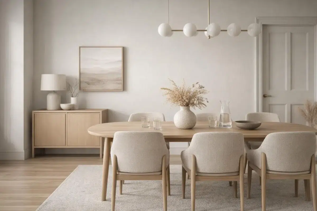
These 2 dining room images show how Drift of Mist (9166) can sit beside timber, table linen, glass and artwork. The greige, grey hue classifications suggest the subtle directions the color may take as the room changes.

Dining room walls wrapped in Drift of Mist enhance intimate gatherings.
@montgomery_manor

Dining room walls in Drift of Mist complement traditional furnishings beautifully.
@threadofgoldhome
Expert Perspectives
Articles and features from across our network of home and design sites.
Coordinating Colors


Eider White reads slightly lighter (LRV 73 vs 69), a gap that shows most in low-lit rooms.

At LRV 69 vs 32, Drift of Mist is decisively the brighter choice.


Drift of Mist reflects far more light (LRV 69 vs 8), opening up a space where Perle Noir encloses it.
Trim Color
Eider White reads slightly lighter (LRV 73 vs 69), a gap that shows most in low-lit rooms.
Similar Colors


With LRVs of 70 and 69, the two reflect almost the same amount of light.


Their light reflectance is nearly identical (LRV 69 vs 69), so neither reads brighter in a room.

Their light reflectance is nearly identical (LRV 69 vs 69), so neither reads brighter in a room.

With LRVs of 69 and 66, the two reflect almost the same amount of light.


With LRVs of 70 and 69, the two reflect almost the same amount of light.


Their light reflectance is nearly identical (LRV 69 vs 67), so neither reads brighter in a room.


Their light reflectance is nearly identical (LRV 70 vs 69), so neither reads brighter in a room.


A 4-point LRV gap (69 vs 66) makes Drift of Mist the marginally brighter of the two.


A 4-point LRV gap (69 vs 65) makes Drift of Mist the marginally brighter of the two.


A 4-point LRV gap (73 vs 69) makes Aesthetic White the marginally brighter of the two.
Complementary Colors


At LRV 69 vs 7, Drift of Mist is decisively the brighter choice.


Their light reflectance is nearly identical (LRV 69 vs 69), so neither reads brighter in a room.


Drift of Mist reflects far more light (LRV 69 vs 20), opening up a space where Soulful Blue encloses it.


Drift of Mist reflects far more light (LRV 69 vs 28), opening up a space where Dusty Heather encloses it.


At LRV 69 vs 47, Drift of Mist is decisively the brighter choice.


At LRV 69 vs 3, Drift of Mist is decisively the brighter choice.

Lavender Wisp reflects far more light (LRV 83 vs 69), opening up a space where Drift of Mist encloses it.
Lighter Colors


A 4-point LRV gap (73 vs 69) makes Snowfall the marginally brighter of the two.


A 6-point LRV gap (75 vs 69) makes Ghosted the marginally brighter of the two.

Natural White reflects far more light (LRV 83 vs 69), opening up a space where Drift of Mist encloses it.


Lunar Lite reads slightly lighter (LRV 73 vs 69), a gap that shows most in low-lit rooms.
Their light reflectance is nearly identical (LRV 69 vs 69), so neither reads brighter in a room.
Darker Colors


A 7-point LRV gap (69 vs 62) makes Drift of Mist the marginally brighter of the two.


At LRV 69 vs 38, Drift of Mist is decisively the brighter choice.


At LRV 69 vs 45, Drift of Mist is decisively the brighter choice.


At LRV 69 vs 45, Drift of Mist is decisively the brighter choice.


Drift of Mist reflects far more light (LRV 69 vs 49), opening up a space where Jogging Path encloses it.
Color Codes
Manufacturer description
This airy, inviting gray feels just right in any space. An ideal neutral that won't appear too dark in areas lacking natural light.