
Quietude
There is more to Sherwin-Williams Quietude (6212) than the swatch alone: its depth, undertones and setting all shape the final impression. A muted saturation softens the hue, giving it a quieter quality that can sit comfortably among layered neutrals. Its related shades below reveal where the color harmonizes—and where contrast brings it fully to life.
Hex
#ADBBB2LRV
47.64
Quietude's Color Strip
Quietude is the second shade on this 7-color strip, sitting between Rainwashed and Halcyon Green. The strip spans from Rainwashed at the lightest end to Jasper at the deepest. Strip 218 puts these related shades in sequence, making it simple to find the tone that suits your room.


Quietude in Rooms
Follow Quietude from one space to another and watch how light, scale and surrounding materials reshape its character. 21 sourced room photos sit alongside 7 generated visualizations.
5 Bathroom Photos
4 sourced photos are joined by 1 generated visualization, offering both observed and imagined settings. Together they show Quietude (6212) as inspiration rather than a promise of an identical result.
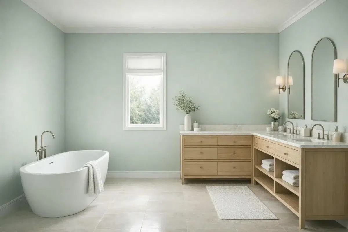
Bathroom walls in Quietude create a peaceful, spa-like retreat.
@mybudgetrecipes

Bathroom walls in Quietude provide a spa-like atmosphere for daily routines.
@christimhightower

Vanity and walls painted Quietude transform the bathroom into a peaceful retreat.
@renatascherb

Bathroom walls in Quietude create an understated, soothing environment.
@renatascherb

A vanity painted in Quietude anchors this serene bathroom design.
@bricksandoak
4 Bedroom Photos
Its place within Living Well and Organic hints at the range of palettes it can inhabit. In this setting, let gentle morning light and low evening lamps and bed linen, timber, wool and upholstered textures guide the final sample decision.

Bedroom painted in Quietude provides ultimate calm and tranquility.
@mybudgetrecipes

Bedroom walls in Quietude foster a restful sleeping environment.
@painter_lady_

Quietude walls establish a calm foundation for bedroom relaxation.
@painter_lady_

Painted in Quietude, bedroom walls promote peaceful sleep and rest.
@painter_lady_
6 Front Door Photos
The threshold between the street and the interior can draw different notes from Quietude (6212). The green, grey hue classifications suggest the subtle directions the color may take as the room changes.

Front entrance door in Quietude makes a serene first impression.
@mybudgetrecipes
1 Home Office Photo
Quietude (6212) brings its green character into a focused room balancing work, concentration and comfort. Its muted saturation softens the color’s edges, making texture and shadow part of the composition.

Home office walls in Quietude foster focused concentration.
@mybudgetrecipes
1 House Photo
Against roofing, masonry, timber, planting and trim, Quietude (6212) may feel quieter, sharper or more atmospheric than the digital swatch alone. An LRV of 47.6 lets the color hold its identity across both brighter and more shaded parts of the room.

Exterior in Quietude presents a composed, sophisticated presence.
@mybudgetrecipes
2 Kitchen Photos
Its place within Living Well and Organic hints at the range of palettes it can inhabit. In this setting, let daylight, task lighting and evening pendants and stone, timber, tile and metal finishes guide the final sample decision.

Kitchen cabinetry in Quietude blends seamlessly with modern aesthetics.
@mybudgetrecipes

Kitchen cabinetry and walls in Quietude work together for cohesive calm.
@welcometowhitebear
2 Living Room Photos
The 2 living room images turn a green swatch into something more spatial and expressive. Its muted saturation softens the color’s edges, making texture and shadow part of the composition.

Living room walls in Quietude establish a harmonious gathering place.
@mybudgetrecipes

Living room in Quietude achieves perfect balance and serenity.
@mandevillecanyoninteriordesign
5 Misc Photos
The 5 misc images turn a green swatch into something more spatial and expressive. Its muted saturation softens the color’s edges, making texture and shadow part of the composition.

Walls in Quietude deliver restful, understated elegance throughout.
@aberdeen_2019

Paint finish in Quietude brings serene sophistication to any surface.
@aberdeen_2019

Furniture painted in Quietude becomes a refined design statement.
@coastal_exchange

Pieces finished in Quietude showcase timeless, calming versatility.
@mcnuttdesigns

Walls painted in Quietude establish a tranquil backdrop for any room.
@petersonhomebuild
2 Kitchen Cabinets Photos
Quietude (6212) moves through 2 kitchen cabinets images without becoming a fixed prescription for the room. Its cool classification can bring a composed, clean tension to warmer finishes.

Painted cabinetry in Quietude creates a serene, minimalist kitchen workspace.
@carypaulstudios

Cabinet doors in Quietude deliver quiet sophistication to kitchen storage.
@georganns_studio
Expert Perspectives
Articles and features from across our network of home and design sites.
Coordinating Colors


At LRV 72 vs 48, Window Pane is decisively the brighter choice.


At LRV 48 vs 32, Quietude is decisively the brighter choice.
Trim Color
At LRV 72 vs 48, Window Pane is decisively the brighter choice.
Similar Colors


With LRVs of 48 and 48, the two reflect almost the same amount of light.


A 4-point LRV gap (48 vs 44) makes Quietude the marginally brighter of the two.


With LRVs of 48 and 47, the two reflect almost the same amount of light.


With LRVs of 51 and 48, the two reflect almost the same amount of light.


A 4-point LRV gap (48 vs 44) makes Quietude the marginally brighter of the two.


With LRVs of 51 and 48, the two reflect almost the same amount of light.


Comfort Gray reads slightly lighter (LRV 54 vs 48), a gap that shows most in low-lit rooms.


Quietude reads slightly lighter (LRV 48 vs 38), a gap that shows most in low-lit rooms.
Complementary Colors

At LRV 79 vs 48, Whimsical White is decisively the brighter choice.


At LRV 48 vs 28, Quietude is decisively the brighter choice.

Quietude reflects far more light (LRV 48 vs 24), opening up a space where Ruby Violet encloses it.

At LRV 48 vs 17, Quietude is decisively the brighter choice.


At LRV 64 vs 48, Wallflower is decisively the brighter choice.


Mauve Finery reads slightly lighter (LRV 51 vs 48), a gap that shows most in low-lit rooms.
Lighter Colors
With LRVs of 48 and 47, the two reflect almost the same amount of light.


At LRV 75 vs 48, Rock Candy is decisively the brighter choice.


Rainwashed reads slightly lighter (LRV 59 vs 48), a gap that shows most in low-lit rooms.
With LRVs of 48 and 48, the two reflect almost the same amount of light.

Darker Colors


At LRV 48 vs 30, Quietude is decisively the brighter choice.
Quietude reads slightly lighter (LRV 48 vs 38), a gap that shows most in low-lit rooms.
Color Codes
Manufacturer description
Fall slowly into this neutral green. For a restful space, inject this cool, light hue with its complex blue-gray undertone.