
Thunderous
Thunderous begins as a green color on paper, then shifts with every surface, shadow and neighboring material. It appears in Pottery Barn Teen, placing it within several distinct decorating stories rather than a single fixed look. Treat the digital swatch as an opening note, then watch a physical sample from morning light through evening lamps.
Hex
#6D6C62LRV
14.86
Thunderous's Color Strip
Thunderous is the sixth shade on this 7-color strip, sitting between Link Gray and Cast Iron. The strip spans from Aloof Gray at the lightest end to Cast Iron at the deepest. Browsing strip 216 alongside this color helps you gauge whether to go lighter, darker, or stay right here.


Thunderous in Rooms
Follow Thunderous from one space to another and watch how light, scale and surrounding materials reshape its character. 19 sourced room photos sit alongside 7 generated visualizations.
1 Bathroom Photo
Across 1 bathroom image, Thunderous (6201) meets window light, mirrors and focused task lighting. Its neutral temperature gives the surrounding palette unusual influence over the final mood.
Bathroom tile work pairs beautifully with Thunderous walls.
@mybudgetrecipes
1 Bedroom Photo
1 bedroom image trace Thunderous (6201) through the slower pace of morning and night. Its place within Pottery Barn Teen hints at the range of palettes it can inhabit.

Bedroom walls in Thunderous establish a bold, restful atmosphere.
@mybudgetrecipes
1 Front Door Photo
Thunderous (6201) moves through 1 front door image without becoming a fixed prescription for the room. Its neutral temperature gives the surrounding palette unusual influence over the final mood.

A Thunderous front door makes a striking architectural statement.
@mybudgetrecipes
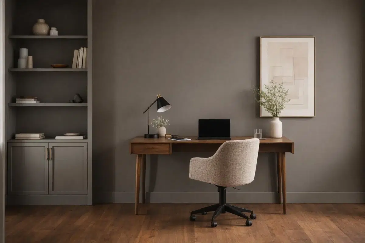
1 Home Office Photo
These 1 home office image show how Thunderous (6201) can sit beside wood, paper, shelving and upholstered seating. The grey hue classifications suggest the subtle directions the color may take as the room changes.

Desk walls painted Thunderous inspire focus in this home office.
@mybudgetrecipes
2 House Photos
Thunderous (6201) moves through 2 house images without becoming a fixed prescription for the room. Its neutral temperature gives the surrounding palette unusual influence over the final mood.

Exterior siding in Thunderous gives this house contemporary curb appeal.
@mybudgetrecipes

Exterior trim in Thunderous complements the home's classic architecture.
@beverlincustomhomes
1 Kitchen Photo
In a hardworking room where color meets movement and strong surfaces, the most interesting quality of Thunderous (6201) may be the way it responds to stone, timber, tile and metal finishes. The grey hue classifications suggest the subtle directions the color may take as the room changes.

Kitchen walls in Thunderous pair elegantly with light wood cabinetry.
@mybudgetrecipes
3 Living Room Photos
Thunderous (6201) offers a starting mood rather than a finished formula: Its neutral temperature gives the surrounding palette unusual influence over the final mood. Test it under the movement from window light to lamplight.

Wall color in Thunderous deepens the cozy living room ambiance.
@mybudgetrecipes

Seating wall in Thunderous frames this comfortable living room.
@athomewithxin

Fireplace accent wall in Thunderous anchors this living room layout.
@athomewithxin
8 Misc Photos
Thunderous (6201) offers a starting mood rather than a finished formula: Its neutral temperature gives the surrounding palette unusual influence over the final mood. Test it under the varied light of hallways, corners and transitional rooms.

Shiplap paneling painted Thunderous adds depth and character.
@taggeboxlane
1 Mudroom Photo
Across 1 mudroom image, Thunderous (6201) meets doorway light and the softer illumination of an internal passage. Its neutral temperature gives the surrounding palette unusual influence over the final mood.

Mudroom walls in Thunderous withstand high-traffic family living.
@pinewoodinterior
7 Kitchen Cabinets Photos
The repetition of doors, drawers and shadow lines can draw different notes from Thunderous (6201). The grey hue classifications suggest the subtle directions the color may take as the room changes.

Upper cabinets in Thunderous contrast beautifully with light lower cabinetry.
@designingthedillons
Expert Perspectives
Articles and features from across our network of home and design sites.
Coordinating Colors


Frosty White reflects far more light (LRV 72 vs 15), opening up a space where Thunderous encloses it.


Ivory Lace reflects far more light (LRV 79 vs 15), opening up a space where Thunderous encloses it.


At LRV 41 vs 15, Gateway Gray is decisively the brighter choice.
Trim Color
Frosty White reflects far more light (LRV 72 vs 15), opening up a space where Thunderous encloses it.
Similar Colors

Their light reflectance is nearly identical (LRV 15 vs 14), so neither reads brighter in a room.


Their light reflectance is nearly identical (LRV 15 vs 13), so neither reads brighter in a room.

Their light reflectance is nearly identical (LRV 15 vs 13), so neither reads brighter in a room.


With LRVs of 15 and 14, the two reflect almost the same amount of light.


Their light reflectance is nearly identical (LRV 15 vs 12), so neither reads brighter in a room.


With LRVs of 15 and 13, the two reflect almost the same amount of light.


With LRVs of 15 and 15, the two reflect almost the same amount of light.


With LRVs of 16 and 15, the two reflect almost the same amount of light.


Their light reflectance is nearly identical (LRV 15 vs 14), so neither reads brighter in a room.


With LRVs of 15 and 13, the two reflect almost the same amount of light.
Complementary Colors


At LRV 69 vs 15, Starry Night is decisively the brighter choice.


Soulful Blue reads slightly lighter (LRV 20 vs 15), a gap that shows most in low-lit rooms.


Dusty Heather reflects far more light (LRV 28 vs 15), opening up a space where Thunderous encloses it.


A 9-point LRV gap (15 vs 6) makes Thunderous the marginally brighter of the two.

A 10-point LRV gap (15 vs 4) makes Thunderous the marginally brighter of the two.


Daydream reflects far more light (LRV 54 vs 15), opening up a space where Thunderous encloses it.

White Iris reflects far more light (LRV 76 vs 15), opening up a space where Thunderous encloses it.
Lighter Colors


Westchester Gray reads slightly lighter (LRV 19 vs 15), a gap that shows most in low-lit rooms.


Classic French Gray reads slightly lighter (LRV 24 vs 15), a gap that shows most in low-lit rooms.


At LRV 34 vs 15, Bedrock is decisively the brighter choice.


At LRV 35 vs 15, Stamped Concrete is decisively the brighter choice.


A 6-point LRV gap (21 vs 15) makes Link Gray the marginally brighter of the two.
Darker Colors
Their light reflectance is nearly identical (LRV 15 vs 13), so neither reads brighter in a room.
Their light reflectance is nearly identical (LRV 15 vs 12), so neither reads brighter in a room.
Their light reflectance is nearly identical (LRV 15 vs 14), so neither reads brighter in a room.


Thunderous reads slightly lighter (LRV 15 vs 10), a gap that shows most in low-lit rooms.
Color Codes
Manufacturer description
Find yourself in the depths of nature with this deep and comforting green. Its cool gray undertone allows it to pair well with other nature-inspired neutrals.