
Chanticleer
At first glance, Chanticleer belongs to the pink family; in a room, light and context can make it far more elusive. Its LRV of 5.2 gives it real visual weight, allowing the color to hold a wall rather than simply recede from view. Because screens flatten both light and texture, sample the paint beside the finishes that will ultimately surround it.
Hex
#870000LRV
5.15
Chanticleer in Rooms
Follow Chanticleer from one space to another and watch how light, scale and surrounding materials reshape its character. 10 generated visualizations explore how the color might shape a finished room.
1 Front Door Photo
1 generated visualization explores how the color might shape the finished space. Together they show Chanticleer (2912) as inspiration rather than a promise of an identical result.
scandinavian front door featuring Chanticleer by Sherwin-Williams
@mybudgetrecipes
1 Bedroom Photo
The slower pace of morning and night can draw different notes from Chanticleer (2912). The pink, red hue classifications suggest the subtle directions the color may take as the room changes.

A boho bedroom painted in Chanticleer
@mybudgetrecipes
1 Dining Room Photo
These 1 dining room image show how Chanticleer (2912) can sit beside timber, table linen, glass and artwork. The pink, red hue classifications suggest the subtle directions the color may take as the room changes.

Chanticleer paint in a traditional dining room
@mybudgetrecipes
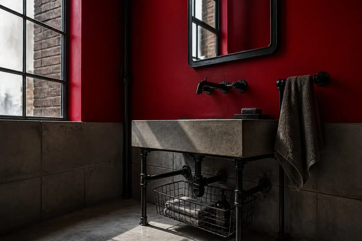
1 Bathroom Photo
Chanticleer (2912) can change noticeably under window light, mirrors and focused task lighting. Sample it beside the finishes that will remain in the room.

Chanticleer — industrial bathroom
@mybudgetrecipes
1 Home Office Photo
These 1 home office image show how Chanticleer (2912) can sit beside wood, paper, shelving and upholstered seating. The pink, red hue classifications suggest the subtle directions the color may take as the room changes.

Sherwin-Williams Chanticleer in a minimalist home office
@mybudgetrecipes
1 Mudroom Photo
Chanticleer (2912) moves through 1 mudroom image without becoming a fixed prescription for the room. Its warm classification can feel inviting beside tactile, natural materials.

Chanticleer paint in a tiny mudroom
@mybudgetrecipes
1 Living Room Photo
The 1 living room image turn a pink swatch into something more spatial and expressive. Its warm classification can feel inviting beside tactile, natural materials.

A mid century living room painted in Chanticleer
@mybudgetrecipes
1 Kitchen Photo
Chanticleer (2912) brings its pink character into a hardworking room where color meets movement and strong surfaces. Its warm classification can feel inviting beside tactile, natural materials.

Chanticleer — bold kitchen
@mybudgetrecipes
1 Patio Photo
1 patio image trace Chanticleer (2912) through the broad shift from bright afternoon to dusk. The pink, red hue classifications suggest the subtle directions the color may take as the room changes.

industrial patio featuring Chanticleer by Sherwin-Williams
@mybudgetrecipes
1 House Photo
The façade’s movement through sun, shade and season can draw different notes from Chanticleer (2912). The pink, red hue classifications suggest the subtle directions the color may take as the room changes.

Chanticleer color — traditional house inspiration
@mybudgetrecipes
Expert Perspectives
Articles and features from across our network of home and design sites.
Coordinating Colors


Pure White reflects far more light (LRV 84 vs 5), opening up a space where Chanticleer encloses it.


Pussywillow reflects far more light (LRV 42 vs 5), opening up a space where Chanticleer encloses it.
Similar Colors

Their light reflectance is nearly identical (LRV 6 vs 5), so neither reads brighter in a room.

With LRVs of 7 and 5, the two reflect almost the same amount of light.

Their light reflectance is nearly identical (LRV 5 vs 5), so neither reads brighter in a room.


Their light reflectance is nearly identical (LRV 7 vs 5), so neither reads brighter in a room.


With LRVs of 8 and 5, the two reflect almost the same amount of light.

With LRVs of 6 and 5, the two reflect almost the same amount of light.

Primary Red reads slightly lighter (LRV 9 vs 5), a gap that shows most in low-lit rooms.


Their light reflectance is nearly identical (LRV 5 vs 5), so neither reads brighter in a room.

Red Prairie reads slightly lighter (LRV 9 vs 5), a gap that shows most in low-lit rooms.


With LRVs of 8 and 5, the two reflect almost the same amount of light.
Complementary Colors


With LRVs of 5 and 5, the two reflect almost the same amount of light.


At LRV 49 vs 5, Undercool is decisively the brighter choice.


A 3-point LRV gap (9 vs 5) makes Connor's Lakefront the marginally brighter of the two.


Candid Blue reflects far more light (LRV 48 vs 5), opening up a space where Chanticleer encloses it.


Major Blue reflects far more light (LRV 29 vs 5), opening up a space where Chanticleer encloses it.


At LRV NaN vs NaN, Clover is decisively the brighter choice.


Briny reflects far more light (LRV 17 vs 5), opening up a space where Chanticleer encloses it.
Lighter Colors
Their light reflectance is nearly identical (LRV 6 vs 5), so neither reads brighter in a room.
Primary Red reads slightly lighter (LRV 9 vs 5), a gap that shows most in low-lit rooms.
Color Codes
Manufacturer description
This sumptuous deep brown conjures the richness of dark chocolate and aged leather, wrapping spaces in an intimate, sophisticated warmth. Perfect for creating a moody sanctuary in libraries, dens, or bedrooms, it pairs beautifully with brass accents and warm cream trim.