
Pearl Gray
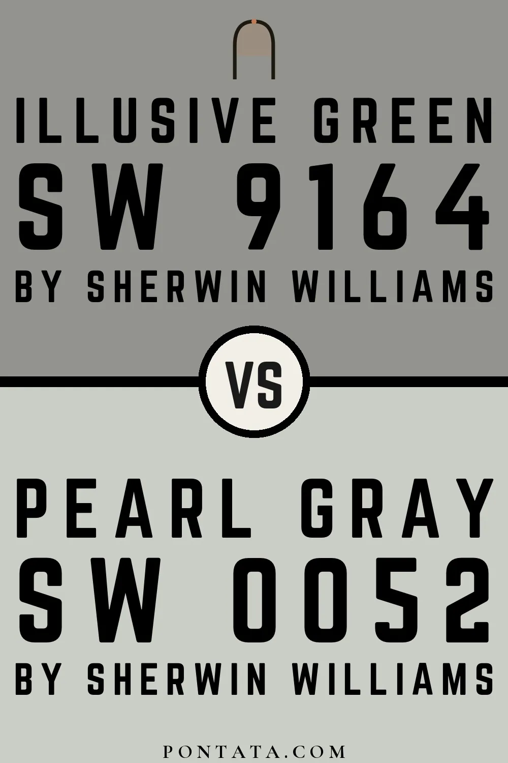
Sherwin-Williams's Pearl Gray is a green shade whose quieter details emerge through comparison. A muted saturation softens the hue, giving it a quieter quality that can sit comfortably among layered neutrals. Because screens flatten both light and texture, sample the paint beside the finishes that will ultimately surround it.
Hex
#CBCEC5LRV
60.87
Pearl Gray in Rooms
Follow Pearl Gray from one space to another and watch how light, scale and surrounding materials reshape its character. 15 sourced room photos offer a closer look at the color in lived-in settings.
3 Misc Photos
3 misc images place Pearl Gray (0052) in an assortment of spaces that reveals the color outside a single design formula. An LRV of 60.9 lets the color hold its identity across both brighter and more shaded parts of the room.
Hallway walls in Pearl Gray create a serene, sophisticated transitional space.
@eltyspremiumpainting

Staircase walls painted in Pearl Gray provide neutral elegance between floors.
@erincavan_

Soft Pearl Gray walls throughout offer versatile, balanced neutral tone.
@specpaintinginc
6 Living Room Photos
Against upholstery, timber, art and metal accents, Pearl Gray (0052) may feel quieter, sharper or more atmospheric than the digital swatch alone. An LRV of 60.9 lets the color hold its identity across both brighter and more shaded parts of the room.

Living room walls in Pearl Gray establish a calm, modern aesthetic.
@specpaintinginc
2 House Photos
Pearl Gray (0052) brings its green character into an exterior viewed across distance, weather and the changing sky. Its muted saturation softens the color’s edges, making texture and shadow part of the composition.

Home exterior in Pearl Gray delivers understated, contemporary curb appeal.
@daguecommunities

Siding in Pearl Gray creates a refined, neutral home exterior.
@daguecommunities
3 Bathroom Photos
Pearl Gray (0052) offers a starting mood rather than a finished formula: Its neutral temperature gives the surrounding palette unusual influence over the final mood. Test it under window light, mirrors and focused task lighting.

Bathroom walls in Pearl Gray offer a spa-like, calming environment.
@bodysurfersuz

Vanity painted in Pearl Gray brings serene, neutral elegance to the bathroom.
@bodysurfersuz

Bathroom walls in Pearl Gray provide a clean, sophisticated backdrop.
@jennypohlman103
1 Bedroom Photo
The slower pace of morning and night can draw different notes from Pearl Gray (0052). The green, grey hue classifications suggest the subtle directions the color may take as the room changes.

Bedroom walls in Pearl Gray establish a restful, peaceful sleeping environment.
@hannahrosehandmade
Coordinating Colors


Westhighland White reflects far more light (LRV 86 vs 61), opening up a space where Pearl Gray encloses it.

Pearl Gray reflects far more light (LRV 61 vs 32), opening up a space where Polished Concrete encloses it.
Similar Colors


With LRVs of 61 and 59, the two reflect almost the same amount of light.


With LRVs of 63 and 61, the two reflect almost the same amount of light.

Their light reflectance is nearly identical (LRV 61 vs 61), so neither reads brighter in a room.


With LRVs of 63 and 61, the two reflect almost the same amount of light.


With LRVs of 61 and 58, the two reflect almost the same amount of light.


With LRVs of 61 and 61, the two reflect almost the same amount of light.


A 3-point LRV gap (64 vs 61) makes Filmy Green the marginally brighter of the two.


Their light reflectance is nearly identical (LRV 61 vs 58), so neither reads brighter in a room.


Silverpointe reads slightly lighter (LRV 64 vs 61), a gap that shows most in low-lit rooms.

A 4-point LRV gap (65 vs 61) makes Pine Frost the marginally brighter of the two.
Complementary Colors

At LRV 61 vs 16, Pearl Gray is decisively the brighter choice.


At LRV 61 vs 28, Pearl Gray is decisively the brighter choice.

At LRV 61 vs 12, Pearl Gray is decisively the brighter choice.

Pearl Gray reflects far more light (LRV 61 vs 11), opening up a space where Plummy encloses it.


Elation reads slightly lighter (LRV 72 vs 61), a gap that shows most in low-lit rooms.


Inspired Lilac reads slightly lighter (LRV 71 vs 61), a gap that shows most in low-lit rooms.


Pearl Gray reflects far more light (LRV 61 vs 16), opening up a space where Forget-Me-Not encloses it.
Lighter Colors


At LRV 74 vs 61, Nebulous White is decisively the brighter choice.


At LRV 77 vs 61, Ice Cube is decisively the brighter choice.


A 11-point LRV gap (72 vs 61) makes Fleur De Sel the marginally brighter of the two.
With LRVs of 63 and 61, the two reflect almost the same amount of light.
Darker Colors


Pearl Gray reflects far more light (LRV 61 vs 37), opening up a space where Coastal Plain encloses it.


Pearl Gray reflects far more light (LRV 61 vs 43), opening up a space where Cascade Green encloses it.


Pearl Gray reads slightly lighter (LRV 61 vs 52), a gap that shows most in low-lit rooms.

At LRV 61 vs 29, Pearl Gray is decisively the brighter choice.
With LRVs of 61 and 59, the two reflect almost the same amount of light.
Color Codes
Manufacturer description
This iconic muted green with blue undertone dates back to the 18th century. A classic standard, this versatile hue lends a cool grace to any space.
Attributed to Sherwin-Williams catalog data.